Category: Growth-Driven Design

3 Quick Wins Uncovered with Growth-Driven Design for a Dental Website

3 Quick Wins We Uncovered with Growth-Driven Design for a Dental Website

It’s been incredible to see how well our client’s dental website has been performing after applying Growth-Driven Design (GDD) tactics.

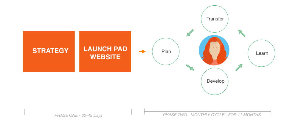
Before I share these 3 quick dental website wins, let me give you a quick run down on what GDD is. Growth-Driven Design is methodology that helps company websites be the best they can be by applying monthly website enhancements that are measured on a regular basis. Every month, we collect data and make website changes based on that data with the goal of a better performing website. Here at Schall, we frequently would tell our clients how our goal was to get as close to perfect as we can with our website build. Now with GDD, we can continue to do that every month.

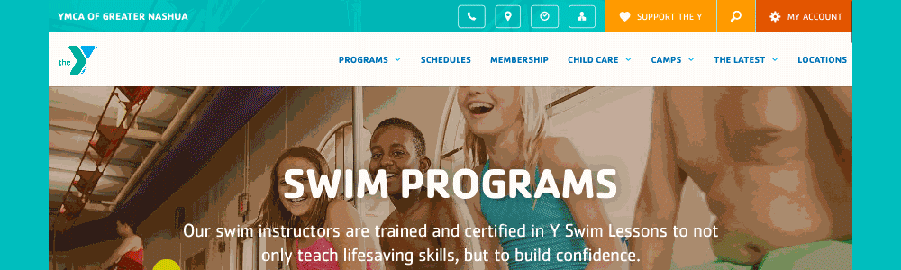
Since we’ve been working on Mann Family’s dental website for several years we didn’t need to build a new launch pad website. Using the existing website, we dove in immediately with user research. What an eye opener this has been. This user research saved us tremendous time and gave us immediate results.

Here are 3 quick dental website insights we learned by using GDD:

1.) Give the people what they want

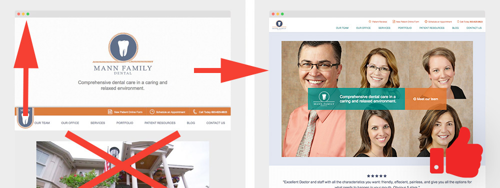
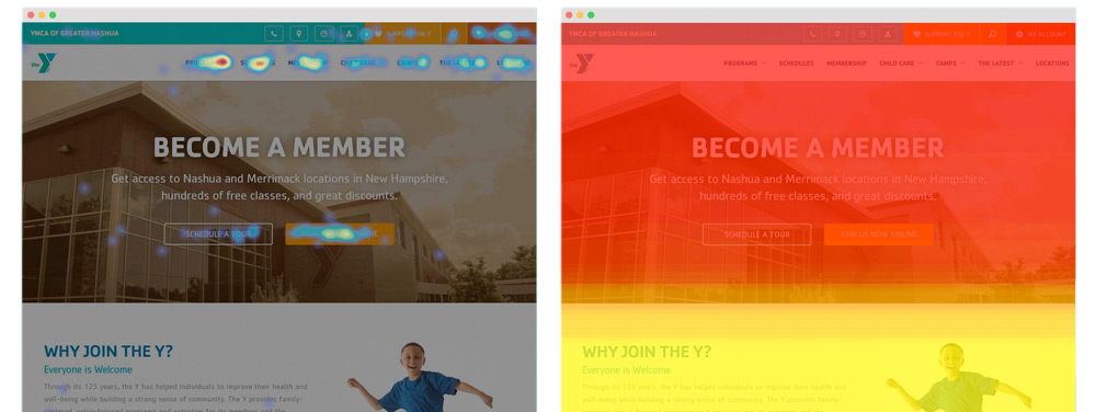
As we gathered data in the form of recordings, heatmaps, click maps and scroll maps, we could see that a large percentage of users wanted to see the dental team. Not only did they scroll through the pictures of the staff, but they read the bios. Maybe they wanted to make sure they were real and they weren’t scary. Seeing this, we decided to place the staff headshots on the home page. This resulted in quicker conversions. After just 1 or 2 clicks, the user would convert into a lead.

Home Page Revamp after Growth-Driven Design

Inbound marketing tips and real inbound stories. Delivered biweekly.

Join our community of results driven marketers.

2. Best practices don’t always work on landing pages

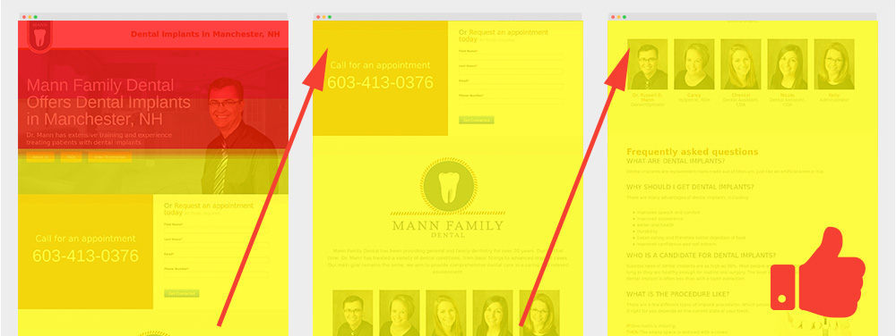
Inbound marketing 101 will tell you to fit all the information you need above the fold on your landing page. Well, when you’re selling a service that involves someone opening their mouth for you, they want a bit more information than you can fit in 1366×768. We developed Dr. Mann’s landing pages to have a lot of information. We kept the form above the fold just in case someone wanted to fill it out without researching, but everything they needed to know was there. From staff bios, to diagrams about the procedure, the potential patient does not have to do any clicking to find out what they need.

We knew the page was converting, but what was interesting to see once we started user testing was that a very high percentage of users were scrolling all the way through this long page. We patted ourselves on the back for going against “best practices” and winning.

Not everything on those pages was a win. The testimonial videos weren’t being watched, and some of the information was inaccurate. We fixes these issues and cleaned up the pages and will continue to monitor user behavior.

Research on Scrolling Behavior for PPC

3.) Mobile compatibility testing is never done

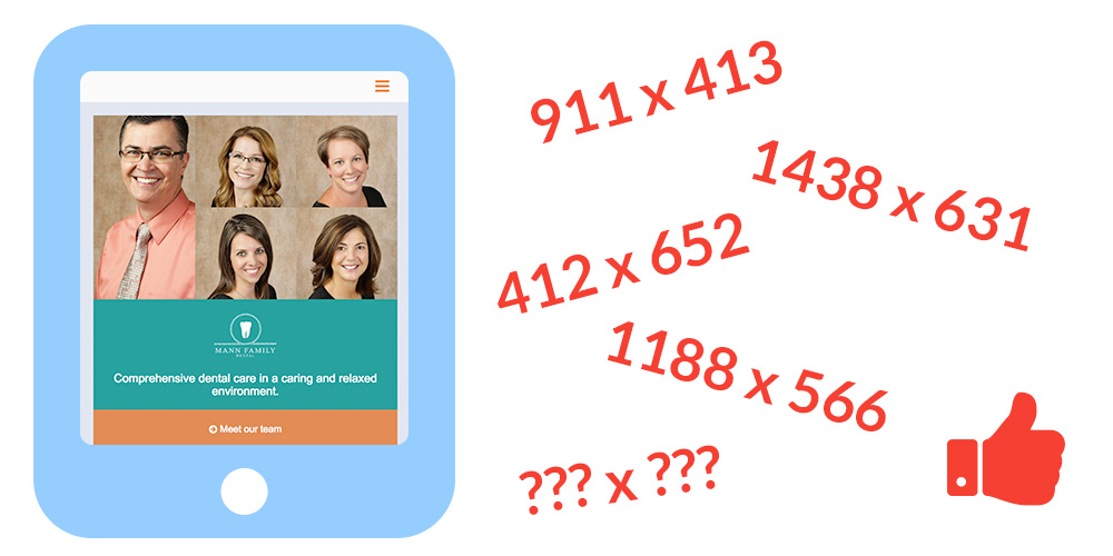
It’s incredible the amount of wacky resolutions we ran into. Resolutions that simply don’t make any sense. Are they old awkward shaped monitors or website visitors that love to view their browser in an odd shape. Who knows? One thing these wacky resolutions that many visitors were using to view the website were causing serious navigation issues. We were able to see how some website visitors were having trouble viewing information on the patient form section on strange resolutions. The main menu would stack and cover form fields which would prevent website visitors from filling them out. Once again, we would have never known how website visitors were spending 3-5 minutes navigating on the website running into these display issues if we didn’t have a close eye on this. Solution: make sure the main menu display correctly for any resolution; wacky or not.

Wacky Resolutions Resolved

Conclusion

There is no set formula on how to design a website or what content each page should have, but by conducting Growth-Driven Design tactics and user experience testing, the changes we have made in just a few months have been significant.


Greatest Lead Generation Tips


A Simple Explanation of Growth-Driven Design and How It Differs From Traditional Web Design

It all starts with a website audit

For years we’ve had discussions on discovering ways to build websites that are as close to perfect as possible. Now with the growth-driven design methodology, we have the opportunity to build a website that is above and beyond our initial expectations.

Our inbound marketing agency started off as a web design shop so it was very common for us to build a website and let it go. Like putting an anchor in the grid (web), we would launch a site, let time go by, and hope the website would perform. During the build we would apply all our skills, knowledge, experience, and “best practices” so that we could launch a site we were proud of, and that the client was happy with. Existing website clients would come back after a couple years requesting website updates, or website improvements, which at times would turn into complete website redesigns. This was the cycle we would fall into; website redesign, spend a couple months on production, throw a new anchor on the grid and wait a couple years for clients to come back for improvements.

Traditional Web Design Graph Timeline

When a client did come back for website improvements, these requests could be great ones or horrible ones. Is the website request a “want” from the client or is it a need for the online visitor? Above all, how will this website request improve the user’s experience and the client’s bottom line? Yes, we had data to finalize website decisions but at the end, all website requests were assumptions and it wasn’t clear if these updates would help the organization’s goals. Growth-Driven Design changes all this.

Inbound marketing tips and real inbound stories. Delivered biweekly.

Join our community of results driven marketers.

Quick Breakdown on Growth-Driven Design

The objective of Growth-Driven Design is to build a launch pad website in 30-45 days, launch it and test it. Before that initial build, the discussion starts off with understanding the company goals and target personas, and it ends with a website wishlist. At the beginning you’ll have a long list of must-haves and nice to have website requests. The game plan would be to filter out the list with must-haves that would pack a punch and deliver results. The thought process would be, “What are the 20% of list items that will make 80% of the business impact?”. Keep in mind that the 30-45 days benchmark for a website launch can vary depending on the size on the website.

Now with the Launch Pad website complete we can focus on the remaining wishlist items and add to this list based on the data we collect. These items are broken down into high, medium and low impacts.

On a monthly basis the selected list item is tested and goes through a Plan, Develop, Learn and Transfer (PDLT) process. In order to understand if this list item was successful or not, a focused-metric is used to measure the outcome. For example, a focused-metric could be a percentage of increase of email signups.

Simple Graph Explaining Growth-Driven Design

Let’s Take A Look At The PDLT Process In Action

As an example, I’ll use a website we recently launched for a YMCA. Here’s an example of how this PDLT process starts:

After our initial website launch, we ran into some user experience (UX) issues. Here are a few that just have to do with one feature, the search bar:

1.) Online visitors would type in a class they were looking for in the search bar. The search bar would immediately display a dropdown of suggested links but the visitor’s action was to press enter instead of clicking the suggested links. By pressing enter key, the user was redirected to page that was displaying results that weren’t what the member was looking for.

2.) People would search for events, branch information, and even staff members using the search bar. At the point of launch, the search bar only searched for programs and classes, so a good amount of people would come up with no results.

Tools Used to Discover These User Experience Issues

We used two recording tools, UsabilityTools and Hotjar. I do like how UsabilityTools shares where the user came to site (Organic, PPC, Social, etc.) when a session in being recorded. On the other hand, Hotjar has several features I enjoy such as, block recording from certain IPs and filter your recording sessions. And for some strange reason I really appreciate how the country’s flags are displayed for each recording. We focused on the recordings that had accessed a lot of pages, because usually those were the people who were a tad frustrated. We could easily see what they were trying to access, and came up with a plan to fix it.

YMCA User Experience Study Using Hotjar's Recording Tool

For heatmaps, click maps and scroll maps we used Crazyegg and Hotjar. It was interesting to discover how users were or weren’t clicking in the places we had assumed they wouldn’t or would. Everyone’s comfort level with computers and the internet is different, and this particular client had a wide range of users. Seeing these maps meant we could learn that quickly.

Heatmap and Scrollmaps Tools Used for Growth-Driven Design Results

Last, we brought in Hubspot’s Leadin to understand in depth what a buyer’s journey was looking like. We took advantage of the chronological history of a converted lead and started to understand specific interests a visitor had on the website. By looking at the search results pages, we could see what was searched for. Now we had an idea of the things the users want to access with this search bar.

Hubspot's Leadin Chronological History of a Conversion

After we gathered this info, we created a hypothesis:

For [Gym Member George] visiting the [Home page], we believe improving [the search feature] in the [Main Menu] will [increase gym class online sign ups by 10%].

The changes we made
First, we created a results page for those users that hit enter after a search. This seemed like such a no-brainer after the fact, but no one ever ran into this issue before launch.

Then, we updated the 404 page. Instead of just being a generic page, we inserted a message telling them there weren’t any results, and coupled it with another search bar so they could try again.

Old URL Solution by adding a search bar in the 404 Error Page

Last, we expanded the search function to include the entire website, rather than just programs and classes. This meant more options for searches, and less frustration for users.

The Outcome After using Growth-Driven Design Techniques

The first thing we noticed was a lot less phone calls from Y members, which meant almost no phone calls from our client to our agency. The initial storm was over, and people were getting the hang of the new site. The search bar was a huge part of that. So many users were used to the old (outdated) layout, they didn’t want to even try navigating the new one. So they used the search bar instead.

The website went live on a Friday. Keep in mind the website is used by several main personas; prospective members, current members and staff. We had to make sure the new website was a smooth transition for everyone. Of course it wasn’t completely seamless, but since we had our tools in place, we were able to stop the bleeding in less than a day. By Monday, everything was pretty quiet and website requests weren’t coming in. We found this odd and by the afternoon we had to call in just to make sure that everything was running smooth and sure enough it was. Mission accomplished.

With Growth-Driven Design, a website is constantly evolving. The website is built around the user rather than the organization’s wants or web trends. The guessing game goes out the window. This all makes a lot of sense simply because as time goes by, technology changes, and quickly. As technology changes, so does human behavior and as human behavior changes, so will how people use websites.


6 MARKETING METRICS YOUR BOSS ACTUALLY CARES ABOUT