
Brand guidelines, also known as brand standards are something that is essentially a set of rules on how your brand works. These guidelines typically include basic information of your company such as history, vision, personality, and key values. Organizations use these guidelines to ensure consistency and strengthen their brand recognition. While working at Disney this past spring, I was able to experience how one of the most recognizable brands in the world manages their image across tens of thousands of employees.
A unique challenge Disney has is managing cast members. They have to make sure that every cast member is representing their brand and that character properly. In learning about branding and brand guidelines in the marketing world, I can see a lot of similarities between the cast member guidelines and the brand guidelines we put together for our clients. Here’s how Disney puts their “brand guidelines” to work everyday with their cast members (using the words “cast members” instead of “employees” is one).
The “Disney Look” vs. Logo/Face of the Company
There is a great big book all about the Disney Look. Have you ever gone to Disney and seen how every cast member looks perfect? There is a reason for that. There is a 20 page book of guidelines each cast member must follow. All the way from hair color to tattoos to nail polish. The Disney Look can compare to the logo and or face of the company. Disney wants to be portrayed a certain way therefore all of their cast members must look that certain way. Brand guidelines do the same thing. They want their logo to look a certain way. It cannot be discolored, cannot be tilted, or shrunk down too small. That is exactly what Disney is doing with their cast members with the Disney Look.
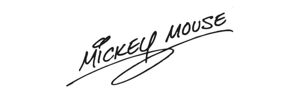
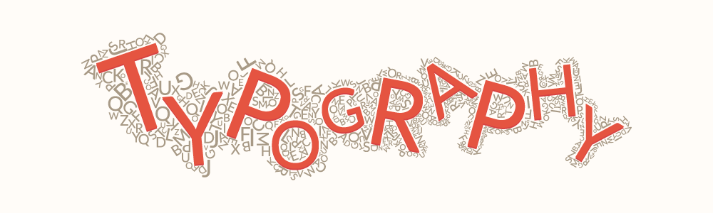
Character Autographs vs. Typography
Almost everyone has seen the famous, Mickey Mouse’s autograph. There is only one Mickey Mouse therefore his autograph is the same every time (with a lot of training that is). Mickey learns how to do his autograph over and over again just like how you learned to write your name! (If you learned how to write your name blindfolded) Mickey’s iconic autograph can be compared to the typography a company may have in their brand guidelines.
Face Character Voice vs. Voice of Your company
If you ever met a Disney face character you know how they talk. How Belle greet’s you with a “bonjour”. If you think these characters are talking silly it’s because they are required to speak like that. Belle is from France so obviously she speaks french to her guests. Every face character is required to speak a certain way to keep their story alive and brands do the exact same thing. In brand guidelines, the voice of the company is a huge part of how the company as a whole should be portrayed. How they speak, how they want you to great guests, how you can advertise and so much more.
Disney is a great company for all companies to learn from because they put the forefront of their brand guidelines to work every single day at Disney locations. These are just three examples but as a former Disney cast member I can promise you there are many, many more. The attention they pay to every detail attributes to their success. These details matter for a small business as much as a they do for a large Fortune 500 company.


Recent Comments