Category: Web Strategy

Website Audit 101: Don’t Skip It

It all starts with a website audit

Website Launch for Granite YMCA Camps 2.0

2019 YMCA Camp Website Launch

It’s incredible how time flies. It was the spring of 2013 when we launched an all boys and all girls overnight camp website for the Granite YMCA. In that time their goals and challenges were different.

2013 Website Goals & Challenges

Back then, the camps were focused on upgrading their outdated websites, and creating something that flowed nicely. Some of their goals were to:

• Maintain membership retention
• Generate leads
• Have information accessible for parents and campers
• Make sure the website was manageable in-house by staff
• Have an easy navigation on mobile devices
• Create something unique while keeping the YMCA brand guidelines in mind.

The result were 2 websites with a simple sitemap and a more modern design. We were all very happy with the results.

Website & UX Audit

When they came to us ready for an upgrade in 2018, we started with a Website & UX audit. With the audits, we discovered there was much room for improvement in the information architecture and the user experience department. 

• Information on pages would overlap, making it confusing for the user
• Both camp website’s experience lacked personality
• Navigation wasn’t as smooth as we’d hoped it would be
• A few important features on the site weren’t easy to update for YMCA staff members
• Interactive PDFs for parents to fill out weren’t cutting it and became challenging

YMCA Camps 2.0

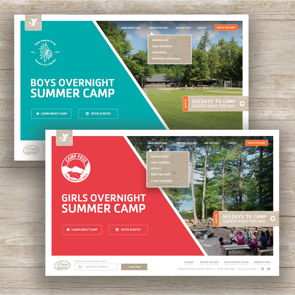
Granite YMCA Camp Websites 2.0

Here are some of the website improvements made for both YMCA Camp websites.

1.) Navigation Menu

Main Menu 2.0

In the previous website version, the main menu was hidden for desktop and mobile devices. It would display after the user clicked the hamburger icon menu located at the top right corner.

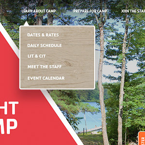
This time around we wanted to save our desktop users that extra click to view the main menu. In addition, the entire information architecture was reevaluated. New web sections were introduced and page titles were addressed to help visitors find the information they were looking for whether it being a parent, camper or staff member.


2.) Background Video

After visiting both camps in-person, it was apparent how different the experience was at an all girl camp and all boy camp. By including a background video on the home page, we were able to ensure that the first impression for our online visitors delivered that unique culture and personality of each camp.


3.) Online Application Forms

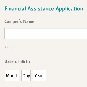
After conducting our audit, it was apparent that more and more users were visiting the website on a mobile device. Therefore, this time around we introduced more online forms so that CIT applicants or Financial Assistance didn’t rely solely on a PDF. By providing the option, we save time for our users and avoid any frustrations for those that are in need of assistance or wish to be part of the camp staff.


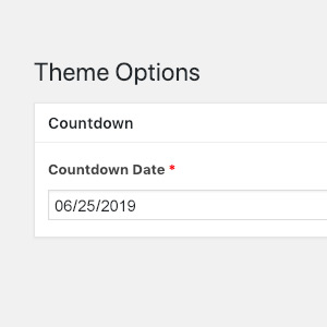
4.) Manageable Countdown

Camp Countdown ACF Feature

It’s important to us for assigned YMCA staff members, such as marketing managers, to have the ability to update copy and images at anytime without being concerned of breaking the layout.

The countdown feature keeps everyone on schedule and needed to be updated once a year. Therefore, a custom setup was built and added to their WordPress admin portal so that staff was able to update the countdown date without needing to know code.


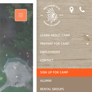
5.) Mobile Menu Navigation

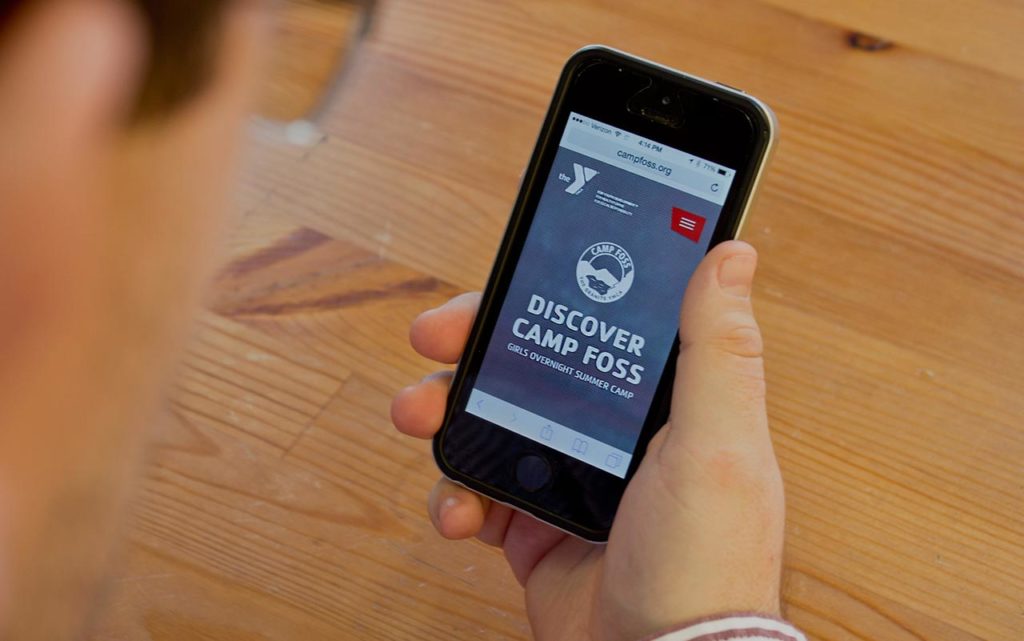
Camp Foss Mobile Menu 2.0

Last but not least, the mobile menu navigation experience went through a revamp. Mobile visitors now have an immediate access to call the camp and/or get directions. Main sections were simplified and helpful arrows trigger animated accordions to dropdown and display more information to access subsections.


Research Doesn’t End Here

Even after the new website launch we started discovering new needs by our visitors. As long as we stay in touch with how the website is being used, we can be ahead the game in getting somewhat close to a perfect website.

Stay agile.


It’s Alive: Importance of Live Chat On Your Website

Why Your Business Should Start Using a Live Website Chat

A 2015 study by Zendesk proved the importance of live chat on a website. It found that 92% customers feel satisfied when they use the live chat feature, compared to other communication options like voice (88%), email (85), web form (85%), and social media (Facebook 84%, Twitter 77%).

Why Live Website Chats Work

Instant Help

Most of the time you just want your answer right away. When you send an email to a company it can be frustrating to get an email back saying they will get back to you in 24-48 hours. Live chat this you to speak with someone and get your answer as fast as they can type it. This leads to awesome reviews for your business from your clients.

Lets customers connect with you

It allows the customers speak with you on a more personal level than email. Of course a phone call would be the most personable form of communication with the customer, but phone calls take more effort from the user. A live website chat is the perfect combination of personality and ease of use. It is a real time conversation that can help you build relationships. To add a little bit more persuasion into your head look at these statistics. Live chat is 12% more effective than email and 29% more effective than phone showing the importance of live chat.

Competitive Advantage

According to the study, out of roughly 1,000 websites only 9% had a live chat feature. If your competitor does not have live chat and the customer has to send them an email in which they will respond within 24-48 hours, your company is more convenient to them which may increase your sales.

Increase in Conversion and Sales

Live chat is effective for whatever it is your business is trying to accomplish. A person who uses live chat is three times more likely to make a purchase, according to American Marketing Association. This is highly effective because your sales team or support staff are more able to change the experience for the customer which leads to the opportunity to create more leads.

More Data

Most live chat features ask a question to the customer prior to connecting them to a employee. Fields like ‘Name, Email, Problem’ are filled out and can also be funneled into your CRM or marketing software. All these questions lead to better reports on problems people are having. Live chats give you a direct connection to your users, and help you address the problems they are having in real time. These reports also collect data like how many people have visited your website, how many people have requested chat, how long each chat usually lasts, how many chats are accepted or ignored, and more. This gives you a way to improve your customer experience with actual data.  

Live website chats are quickly gaining in popularity, and users are starting to expect them on a site. The importance of live chat is a long list and we recommend setting up a trial so you can start delighting your website users and building your relationships.

Want to give live chat a try? Click here for a 30 day free trial!

How Your First Meeting With an Agency Dictates the Success of Your Website Project

website project

Web development is a unique profession. It requires technical ability, creative prowess, psychological expertise, and superb communication skills. To launch a website that really tells the story of a brand, and gets users to act, you need all of these things. But the most important part of the web design and development process is the communication between the brand and its agency. I’m not talking about responding to emails in a timely manner, or answering the phone at all hours of the night. I’m talking about how an agency gets the right information out of a client, and then takes that information to create something unexpected but also close to perfect.

“This site is so much better than our competition’s.”

“The look and feel of the site is exactly what we were after.”

“I’m thrilled that you were able to pull this off.”

These are all fantastic testimonials from clients. The website project measured up to their expectations, and that’s great. But as web designers and developers, we should be striving for more.

“You took what was in my head before I even knew it was there, and then put it on the screen.”

“You gave us what we didn’t even know we needed when we started this process.”

“I never knew our website could solve these problems we had.”

When we get these types of compliments, we know we really knocked it out of the park. To get to this point, the very first meeting with a client needs to set the stage. There are a few things that need to be present in that first meeting (or meetings) to get there.

Chemistry

Chemistry sort of feels like an arbitrary word for “we like each other,” but it is still important. If you don’t feel a connection with the agency across the table, it’s worth figuring out why. The questions you ask yourself could lead you to another issue that needs to get sorted out before you start working together. I recently spoke with a marketing director about what they look for when they are choosing an agency. “Someone I can see myself having a beer with,” was one of the first things he said. If you don’t have that chemistry, everything that follows could seem a bit forced.

The Right Questions

It’s the agency’s job to ask the right questions when you discuss your website project with them. In my eyes, this is the absolute most important part of my job. In every discovery meeting, I search for the answers that get to the bottom of their needs. My main goal is to uncover a real challenge that they are having, even if they think it’s unsolvable at this moment. It’s more than having your list of questions prepared. It’s reading the client or prospect and getting deeper into things that might seem unrelated to the website.

Trust

It’s the agency’s responsibility to earn a client’s trust early on in, preferably well before any contract is signed. An agency should never have to twist someone’s arm to get them to sign a contract. The day that contract is signed should feel like a happy moment, because that trust is there. A website project isn’t something you buy off the shelf, so a company really has no idea what they are going to get when a project starts. So they have to have a deep understanding of how the agency works and really why they do what they do, and trust that process for their own brand.

Ownership

When an agency understands the client’s needs, they need to take ownership of the project to get there. The agency’s #1 goal should be seeing that client succeed. And if everything is working the way it should be, this sense of ownership will be automatic.

3 Quick Wins Uncovered with Growth-Driven Design for a Dental Website

3 Quick Wins We Uncovered with Growth-Driven Design for a Dental Website

It’s been incredible to see how well our client’s dental website has been performing after applying Growth-Driven Design (GDD) tactics.

Before I share these 3 quick dental website wins, let me give you a quick run down on what GDD is. Growth-Driven Design is methodology that helps company websites be the best they can be by applying monthly website enhancements that are measured on a regular basis. Every month, we collect data and make website changes based on that data with the goal of a better performing website. Here at Schall, we frequently would tell our clients how our goal was to get as close to perfect as we can with our website build. Now with GDD, we can continue to do that every month.

Since we’ve been working on Mann Family’s dental website for several years we didn’t need to build a new launch pad website. Using the existing website, we dove in immediately with user research. What an eye opener this has been. This user research saved us tremendous time and gave us immediate results.

Here are 3 quick dental website insights we learned by using GDD:

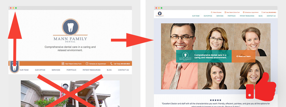
1.) Give the people what they want

As we gathered data in the form of recordings, heatmaps, click maps and scroll maps, we could see that a large percentage of users wanted to see the dental team. Not only did they scroll through the pictures of the staff, but they read the bios. Maybe they wanted to make sure they were real and they weren’t scary. Seeing this, we decided to place the staff headshots on the home page. This resulted in quicker conversions. After just 1 or 2 clicks, the user would convert into a lead.

Home Page Revamp after Growth-Driven Design

Inbound marketing tips and real inbound stories. Delivered biweekly.

Join our community of results driven marketers.

2. Best practices don’t always work on landing pages

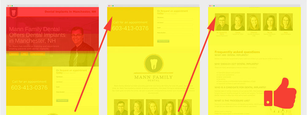
Inbound marketing 101 will tell you to fit all the information you need above the fold on your landing page. Well, when you’re selling a service that involves someone opening their mouth for you, they want a bit more information than you can fit in 1366×768. We developed Dr. Mann’s landing pages to have a lot of information. We kept the form above the fold just in case someone wanted to fill it out without researching, but everything they needed to know was there. From staff bios, to diagrams about the procedure, the potential patient does not have to do any clicking to find out what they need.

We knew the page was converting, but what was interesting to see once we started user testing was that a very high percentage of users were scrolling all the way through this long page. We patted ourselves on the back for going against “best practices” and winning.

Not everything on those pages was a win. The testimonial videos weren’t being watched, and some of the information was inaccurate. We fixes these issues and cleaned up the pages and will continue to monitor user behavior.

Research on Scrolling Behavior for PPC

3.) Mobile compatibility testing is never done

It’s incredible the amount of wacky resolutions we ran into. Resolutions that simply don’t make any sense. Are they old awkward shaped monitors or website visitors that love to view their browser in an odd shape. Who knows? One thing these wacky resolutions that many visitors were using to view the website were causing serious navigation issues. We were able to see how some website visitors were having trouble viewing information on the patient form section on strange resolutions. The main menu would stack and cover form fields which would prevent website visitors from filling them out. Once again, we would have never known how website visitors were spending 3-5 minutes navigating on the website running into these display issues if we didn’t have a close eye on this. Solution: make sure the main menu display correctly for any resolution; wacky or not.

Wacky Resolutions Resolved

Conclusion

There is no set formula on how to design a website or what content each page should have, but by conducting Growth-Driven Design tactics and user experience testing, the changes we have made in just a few months have been significant.


Greatest Lead Generation Tips


A Simple Explanation of Growth-Driven Design and How It Differs From Traditional Web Design

It all starts with a website audit

For years we’ve had discussions on discovering ways to build websites that are as close to perfect as possible. Now with the growth-driven design methodology, we have the opportunity to build a website that is above and beyond our initial expectations.

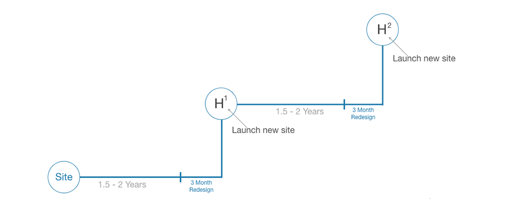
Our inbound marketing agency started off as a web design shop so it was very common for us to build a website and let it go. Like putting an anchor in the grid (web), we would launch a site, let time go by, and hope the website would perform. During the build we would apply all our skills, knowledge, experience, and “best practices” so that we could launch a site we were proud of, and that the client was happy with. Existing website clients would come back after a couple years requesting website updates, or website improvements, which at times would turn into complete website redesigns. This was the cycle we would fall into; website redesign, spend a couple months on production, throw a new anchor on the grid and wait a couple years for clients to come back for improvements.

Traditional Web Design Graph Timeline

When a client did come back for website improvements, these requests could be great ones or horrible ones. Is the website request a “want” from the client or is it a need for the online visitor? Above all, how will this website request improve the user’s experience and the client’s bottom line? Yes, we had data to finalize website decisions but at the end, all website requests were assumptions and it wasn’t clear if these updates would help the organization’s goals. Growth-Driven Design changes all this.

Inbound marketing tips and real inbound stories. Delivered biweekly.

Join our community of results driven marketers.

Quick Breakdown on Growth-Driven Design

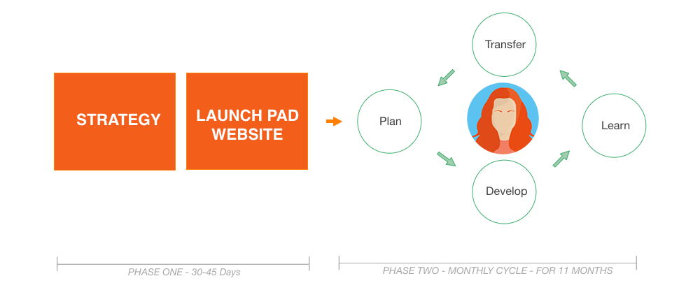
The objective of Growth-Driven Design is to build a launch pad website in 30-45 days, launch it and test it. Before that initial build, the discussion starts off with understanding the company goals and target personas, and it ends with a website wishlist. At the beginning you’ll have a long list of must-haves and nice to have website requests. The game plan would be to filter out the list with must-haves that would pack a punch and deliver results. The thought process would be, “What are the 20% of list items that will make 80% of the business impact?”. Keep in mind that the 30-45 days benchmark for a website launch can vary depending on the size on the website.

Now with the Launch Pad website complete we can focus on the remaining wishlist items and add to this list based on the data we collect. These items are broken down into high, medium and low impacts.

On a monthly basis the selected list item is tested and goes through a Plan, Develop, Learn and Transfer (PDLT) process. In order to understand if this list item was successful or not, a focused-metric is used to measure the outcome. For example, a focused-metric could be a percentage of increase of email signups.

Simple Graph Explaining Growth-Driven Design

Let’s Take A Look At The PDLT Process In Action

As an example, I’ll use a website we recently launched for a YMCA. Here’s an example of how this PDLT process starts:

After our initial website launch, we ran into some user experience (UX) issues. Here are a few that just have to do with one feature, the search bar:

1.) Online visitors would type in a class they were looking for in the search bar. The search bar would immediately display a dropdown of suggested links but the visitor’s action was to press enter instead of clicking the suggested links. By pressing enter key, the user was redirected to page that was displaying results that weren’t what the member was looking for.

2.) People would search for events, branch information, and even staff members using the search bar. At the point of launch, the search bar only searched for programs and classes, so a good amount of people would come up with no results.

Tools Used to Discover These User Experience Issues

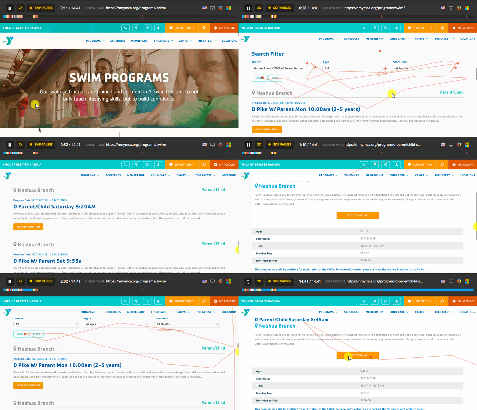
We used two recording tools, UsabilityTools and Hotjar. I do like how UsabilityTools shares where the user came to site (Organic, PPC, Social, etc.) when a session in being recorded. On the other hand, Hotjar has several features I enjoy such as, block recording from certain IPs and filter your recording sessions. And for some strange reason I really appreciate how the country’s flags are displayed for each recording. We focused on the recordings that had accessed a lot of pages, because usually those were the people who were a tad frustrated. We could easily see what they were trying to access, and came up with a plan to fix it.

YMCA User Experience Study Using Hotjar's Recording Tool

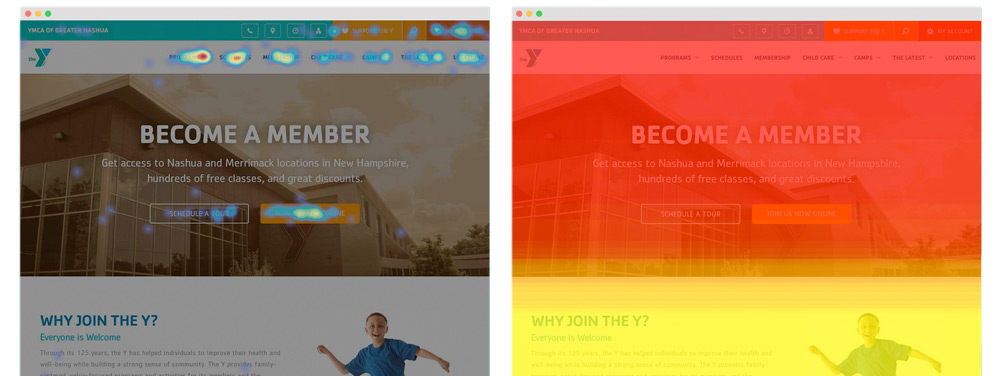
For heatmaps, click maps and scroll maps we used Crazyegg and Hotjar. It was interesting to discover how users were or weren’t clicking in the places we had assumed they wouldn’t or would. Everyone’s comfort level with computers and the internet is different, and this particular client had a wide range of users. Seeing these maps meant we could learn that quickly.

Heatmap and Scrollmaps Tools Used for Growth-Driven Design Results

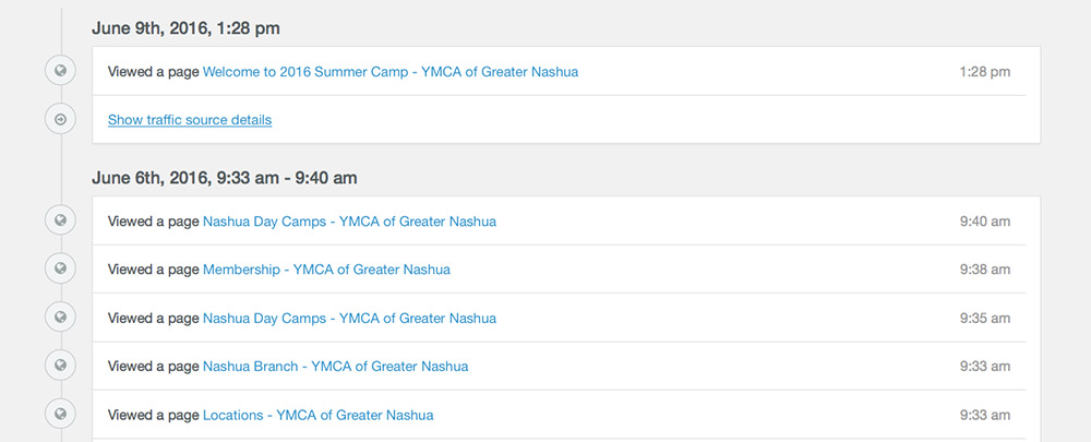
Last, we brought in Hubspot’s Leadin to understand in depth what a buyer’s journey was looking like. We took advantage of the chronological history of a converted lead and started to understand specific interests a visitor had on the website. By looking at the search results pages, we could see what was searched for. Now we had an idea of the things the users want to access with this search bar.

Hubspot's Leadin Chronological History of a Conversion

After we gathered this info, we created a hypothesis:

For [Gym Member George] visiting the [Home page], we believe improving [the search feature] in the [Main Menu] will [increase gym class online sign ups by 10%].

The changes we made
First, we created a results page for those users that hit enter after a search. This seemed like such a no-brainer after the fact, but no one ever ran into this issue before launch.

Then, we updated the 404 page. Instead of just being a generic page, we inserted a message telling them there weren’t any results, and coupled it with another search bar so they could try again.

Old URL Solution by adding a search bar in the 404 Error Page

Last, we expanded the search function to include the entire website, rather than just programs and classes. This meant more options for searches, and less frustration for users.

The Outcome After using Growth-Driven Design Techniques

The first thing we noticed was a lot less phone calls from Y members, which meant almost no phone calls from our client to our agency. The initial storm was over, and people were getting the hang of the new site. The search bar was a huge part of that. So many users were used to the old (outdated) layout, they didn’t want to even try navigating the new one. So they used the search bar instead.

The website went live on a Friday. Keep in mind the website is used by several main personas; prospective members, current members and staff. We had to make sure the new website was a smooth transition for everyone. Of course it wasn’t completely seamless, but since we had our tools in place, we were able to stop the bleeding in less than a day. By Monday, everything was pretty quiet and website requests weren’t coming in. We found this odd and by the afternoon we had to call in just to make sure that everything was running smooth and sure enough it was. Mission accomplished.

With Growth-Driven Design, a website is constantly evolving. The website is built around the user rather than the organization’s wants or web trends. The guessing game goes out the window. This all makes a lot of sense simply because as time goes by, technology changes, and quickly. As technology changes, so does human behavior and as human behavior changes, so will how people use websites.


6 MARKETING METRICS YOUR BOSS ACTUALLY CARES ABOUT


7 Significant Conclusions We Learned After a YMCA Website Launch

7 Significant Conclusions We Learned After a YMCA Website Launch

On Superbowl Sunday, 2016 we launched the brand new YMCA Greater Nashua website. After more than four months of research, design, and development, our project was coming to an end. But after launch, we didn’t just celebrate and let the website out into the world. We kept an eye on things to make sure the website was performing as best as it could for their 10,000 – 15,000 unique monthly visitors. Using tactics such as heatmapping and lead generation, we set up some systems that could teach us about the website users post launch.

With the data we collected, we were able to make impactful changes on the fly, and make sure the website users were having a great experience. Here are a few things we learned in the first two weeks post-launch.

1.) 57% of Engaged Users Were on a Mobile Device

When looking at the users that spent more than 10 seconds on the website, 57% of them were on a phone or a tablet. Knowing this, we had to make sure a mobile visitor could perform the same actions as a desktop user. One of the changes we made post-launch was to make sure the search bar was fully functional on a mobile device.

We also noticed that mobile visitors were more likely to stay on the website to register online instead of using their Daxko login to browse programs.

Looking at the scroll heatmaps, we found that mobile visitors were more apt to scroll than a desktop user would.

YMCA Mobile Web Design

2.) Most Users Want to See Classes and Programs

The data we collected before the website build showed us that the majority of users were looking for programs or schedules. So we made sure these two menu items were extremely accessible from the homepage. Looking at the heatmaps after launch just reinforced what we already knew. Over 24% of clicks were to a program page, and about 20% went to the schedules page.

YMCA Website Heatmap

3.) People Still Love PDF Schedules

Being tech-minded, this was a little surprising to us. It turns out that a solid amount of people would rather download a full PDF schedule than use the mobile app feed on the website, or download the mobile app on their phone.

We still made sure to encourage members to download the YMCA App for Apple or Android. But sometimes we would even encounter users downloading the app and also the PDF schedule on their way out.

YMCA PDF Schedules

4.) Some YMCA Members Like to Browse Through Daxko

After day one of testing, immediately members would look for a way to log in to register for programs. The old website had a Register button at the top where people could log in directly to Daxko, and they were missing that feature after the new website was launched. Even though the programs were now feeding to the website pages, we saw that we needed to put this option back. With the update, members had the option to choose between logging into Daxko or staying on the new website.

YMCA website Daxko

5.) It’s Easy for Daxko Program Tags to Get Out of Control

After we linked the new website to Daxko using Program Connector, hundreds of defunct program tags were fed through. This made it easy for our clients to see that in order for this to work efficiently, they were going to need to do some spring cleaning. Our clients responded quickly and trimmed down the program tags from hundreds to 23 well organized tags for the program connector to pull in.

Now that Daxko information is being fed directly into the website, it’s also easy to discover where class titles, descriptions, times, fees or contact information were missing for each program. If information was missing or outdated, the assigned program director was reached so he or she could log into Daxko and make the right update.

Daxko Program Tags

6.) A Properly Functioning Search Bar Can Do Wonders

Accessing the search bar was an immediate behavior. It helped tremendously for new and especially for existing members to find information quickly. The search feature for mobile was brought to the forefront to make sure mobile visitor access to search for anything at all times. Since they didn’t have a search bar before the new website launched, we weren’t able to foresee the impact this feature could have. By testing the website post-launch we were able to understand that this is often the quickest and easiest way for users to find what they’re looking for.

YMCA website search

7.) Capturing Leads is Easy

We set up a few forms on the new website to start collecting leads. One is a pop up form for a free 3-day-pass and the other is a form for members interested in scheduling a tour. This is the first time this YMCA has had anything set up for collecting leads, so our goal was a 1.5% conversion rate.

2 weeks later, we’re at a 3.1% conversion rate. That means that out of every 100 people that see a form, 3 of them fill it out. This is double what we had as our goal.

The welcome center directors get an email notification when a lead comes in, and they follow up by phone or email. All the information is fed into a MailChimp account, so if they want to change to a more automated approach in the future they can.

Seeing such a positive response to these forms opens up a lot of opportunities for inbound marketing tactics in the future–a lot of opportunities that we would not know about if we hadn’t kept track of these things post launch. We now know what a YMCA website is capable of and we are so excited to share it.

YMCA website search

A website is not complete right after it’s launched. By paying attention to the users, you can make small changes over time that will have a huge impact on how people interact with your website. We never thought we would learn this much in just 2 weeks after launching nmymca.org, but we’re happy we did, and very excited to bring these lessons with us to any projects we have to follow.


YMCA Free Consultation


What Does a Website Cost? A Full Breakdown by an Agency

A complete breakdown of what a website cost by an agency.

What will this website cost me? As a digital marketing agency, it’s only natural for this question to appear often in meetings.

Digital agencies each have their own hourly rate. This hourly rate can go anywhere from $150 and up. Ask what the agency’s hourly rate is and you can ballpark what it would cost your company to build a website based on the estimated hours of production provided below.

Digital agencies also have their own website production process. At Schall, a website project is broken down into four main phases:

Shortcuts

* Final website investments are determined by the size of website, amount of content, functionality, and client goals. The estimated production of hours shared in this article is a ballpark time investment for each phase, based on our own projects.

1. Discovery Phase ( 30 hours* )

1a. Client Interview

In the client interview we’ll uncover current struggles in an organization, go deep into understanding company goals and get a sense of company culture.

1b. User Research

Listening to the user is vital for a successful website as we discover how to improve flaws within a website. The objective is to find a happy medium between company goals and user website satisfaction.

1c. Site Audit / Audience Trend Analysis / Competitor Analysis

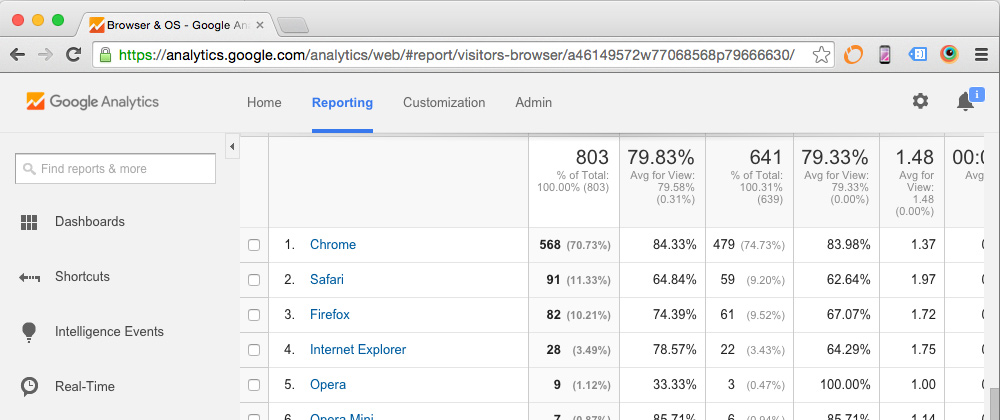
It’s always interesting, and sometimes upsetting, to see where a website stands in a Google search in comparison with the competition. With tools such as Raven and HubSpot, we get a gauge on where a client’s website stands. While Google Analytics and Google Webmaster Tools will help narrow down user trends to exclude any ignored sections that are taking up real estate. This overall analysis lets us start from the ground up, so we’re not basing our website ideas off of what’s already out there.

Google Analytics to uncover user trends

1d. Personas

After doing research on the client’s target demographic, personas are created. Personas are fictional, generalized representations of your ideal customers. This allows us to truly have the user in mind, and not just a mysterious group of people in an age group and location.

I found it funny to discover MailChimp’s ideal user. He had all my characteristics and they even named him Fred.
 

Example of use of Personas by Mailchimp

Example of Persona used by MailChimp

Inbound marketing tips and real inbound stories. Delivered biweekly.

Join our community of results driven marketers.

1e. Content

I’m sure you’ve heard this before and here you’ll read it one more time, “Content is king”. It doesn’t matter how beautiful your website is or how functional it may be if the copy is not speaking the targeted audience’s language. The objective is to obsess over the user to roll out well thought out quality content that brings priceless value to the table always.

1f. Information Architecture / Sitemap

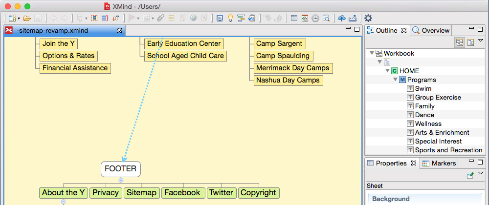
Once all the web content junk has been stripped out, the story of how the user will navigate through the website gets structured. Before even taking this to XMind, a mapping software to graph a website site map, we’ll get the team together, roll out the whiteboard, grab a few stacks of post-its and role play different scenarios on how a user would navigate through this new website to achieve his or her goal.
 
XMind - Website Sitemap Example - Mapping Software
 

1g. Wireframes

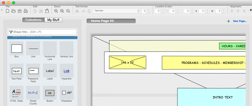
You can’t build a house without a blueprint. The wireframe stage is the blueprint for building websites. This is typically a barebones display of boxes for how each page of a website will be laid out. Pencil, a prototyping tool, speeds the process in preparing these website blueprints that are later used in the Creative Phase. Invision, another prototyping tool taken to the next level, gives the ability to make wireframes interactive.
 
Pencil - Prototyping Tool Wireframe Example


2. Creative Phase ( 60 hours* )

2a. Photography / Videography

To create trust through a virtual experience, high quality authentic photography is a must. Compared to stock photography, original photos that are specific to the company, deliver unique emotion and bring more value. A video with great lighting, interesting angles, and a strong story invites the user into a virtual world that’s personalized. Now that technology is improving, we can invite the user into an interactive 360 video and give them a tour of your world from all angles, and they control it from a touch of a mouse to a tilt of a phone.

2b. Moodboard

The moodboard process helps cut through the noise and organize thoughts. Many times this is where the best ideas are born. The beauty about this process is that a team doesn’t have their hands tied and inspiration becomes limitless. In the past, we would cut out pieces of a magazine and physically paste our inspirations onto a large blank poster to share thoughts to a client. A display of different colors and font types would also join the party. Times have changed and this is a process that can be done virtually and collaboratively with Boards by Invision.

2c. User Experience Design

Websites are evolving and UX plays a large role in this evolution. The UX focus is having a deep understanding of how the user thinks, lives and speaks. What type of blog articles does a user read, what type of devices do they use and how they use them. A study on user actions and gestures goes a long way. No longer are the days of creating a pretty button for the sake of it. What is the purpose of that button? What task does this button fulfill and does it bring value to the user? A website today should be a list of tasks that solves problems.

2d. User Interface Design

The fun begins in the user interface design process. Many times it is tempting to jump right into Photoshop or Sketch and have your ideas run free. This process is where the actual website design takes place. All web elements from the Discovery and Creative Phase up to this point gets implemented into this website design. These web elements are building blocks. If any of them are missing, your stack of blocks will fall.

2e. Prototyping

Not too long ago, our Creative Phase presentation with clients was a show and tell of static web design layouts. We would share all versions; desktop, tablet and smartphone layouts in this presentation. Now, our prototyping stage is interactive. All static website layouts are brought to life using Invision. This gives our clients the opportunity to experience and actually see how the website is going to perform with a touch or hover action. The outcome of the presentation is less of an explanation of what’s being accomplished with the new layout, and more of a participation from the client in how to improve the overall website experience.
 
Interactive Prototyping using Invision


3. Development Phase ( 60 hours* )

3a. Content Management System

Gone are days of static websites. Once the Creative Phase has been approved, website designs are stripped and built on a content management system. This way the website is manageable in-house by the marketing team. Amongst many, WordPress and HubSpot CMS are two industry leading platforms that standout to be user-friendly with powerful content marketing capabilities.

3b. Functionality

Common website functionalities can be online forms to increase sales, email signups to build a subscriber list or special shipping options for eCommerce websites. Each organization has unique challenges and goals. Web functionalities are built to satisfy the purposes of the website.

3c. 3rd Party Integrations

Newsletter integrations will capture emails into your favorite email platform; MailChimp or Constant Contact. Google Maps Integrations will let your user have easy access to finding you online. Inbound Marketing Software integrations, like HubSpot, will monitor your marketing efforts in one sales tool platform. All necessary integrations are done during this process.

3d. Responsive

A mobile experience is unique from a desktop experience. For this reason, a mobile design is created with unique navigations, menus, and content for optimal conversions when accessed through a mobile device. This responsive design then goes through a testing process and is opened on smartphones and tablets. The number of online visitors accessing a website from a mobile device is increasing rapidly, so mobile user experience is more important than ever.


4. Debugging Phase ( 20 hours* )

4a. Cross-Browser Compatibility

There are several preferences when it comes to web browsers; Firefox, Chrome, Opera and Safari to name a few. Each have different rules, especially Internet Explorer. The website is tested on the top browsers preferred by current visitors to make sure the website experience is smooth across the board.

4b. User Testing

A group of people are asked to participate to access the website. This last step is performed on both desktop and mobile. This is an opportunity to correct any flaws of the overall website experience and to study how the visitor interacts with the website from start to finish.

4c. Web Server Optimization

The website is optimized to reach it’s maximum efficiency. Code is compressed to improve load performance for desktop and mobile. Content Delivery Networks ensure users can load the website quickly. All images are losslessly compressed to enhance performance.

Client Relationship and Project Management. ( 20 Hours* )

Meetings / Travel

There are a number of meetings that take place during each phase. In some cases there is travel involved, other times it’s a phone or web meeting. This is all time that is taken into account with each project.

Project Management

To keep the client in the loop, a project management software is used called Basecamp. The client is notified when they have homework, and they can dive into the software to learn about where the website is in the process and what work is being put in.

Website Training

When a website is launched, there is also a training session scheduled. Anyone who has a responsibility to update the new website is invited to attend, and they all learn the process from start to finish.
 
There are many steps to go through when building a website, some of which often go unseen. Each phase needs the other ones in order to shape the best possible product and to generate great results.


6 MARKETING METRICS YOUR BOSS ACTUALLY CARES ABOUT


6 Awesome Ways WordPress and HubSpot Work Together

7 Awesome Ways Wordpress and HubSpot Work Together

Yes, WordPress and HubSpot do work well together. No, you don’t have to choose between them.

There are a lot of reasons an organization chooses to have their website on WordPress and, by demand, most of the websites we build here at Schall Creative run on the popular platform. Since it’s so widely used, it’s easy to find support for a WordPress site via a web developer or simply by visiting WordPress forums and searching for a solution. Most importantly, it’s easy for our clients to make simple updates to their website on their own when they use WordPress.

HubSpot is a platform that focuses on inbound marketing and tracking results. When an organization is ready for their website to start doing work, (not just looking pretty) we find that HubSpot is the way to go.

Here are some great ways WordPress and HubSpot work together:

1. Install the HubSpot Tracking Code

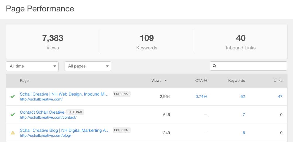
The HubSpot Tracking Code will connect your WordPress website and start sending online traffic information to HubSpot. The code collects data from your WordPress site and sends it to your HubSpot account. You’ll be able to view your website traffic and page performance of every page regardless of if it lives in HubSpot or WordPress.

Wordpress and HubSpot Page Performance Tool

2.) Embed HubSpot CTAs on your WordPress website

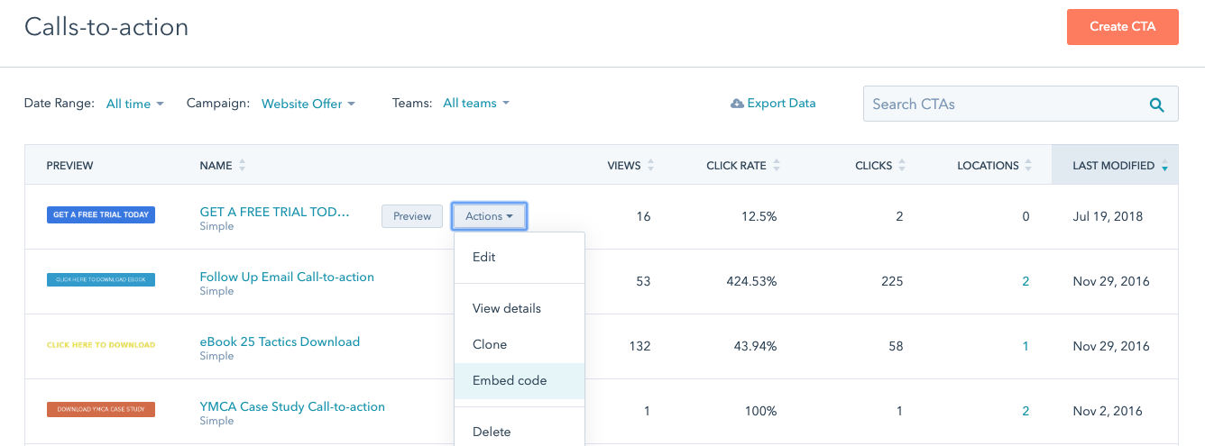
Once you have a well thought out copy and creative to use as your Call to Action, bring it into HubSpot to track its performance and embed it into your blog articles and/or web pages.

Every CTA has an embed code so it can live externally.

Embed HubSpot CTA to WordPress


7 Awesome Ways WordPress and HubSpot Work Together


3.) Generate leads by using custom flyout HubSpot forms

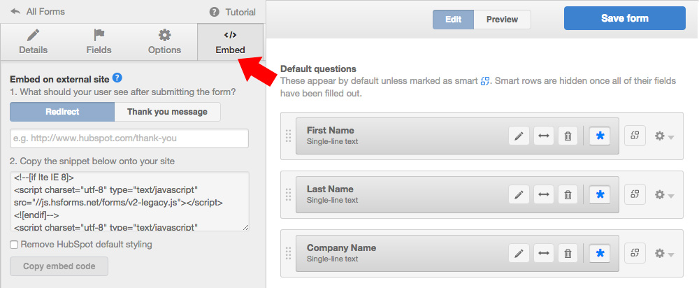
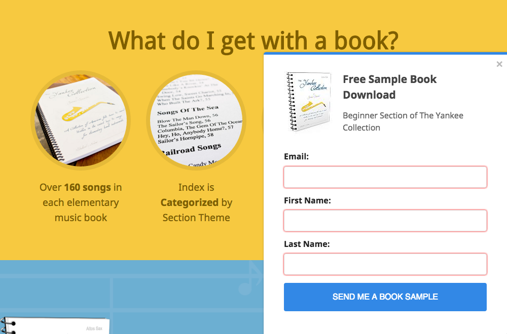
If you have an offer you’d like to share with your website visitors, you have the ability to create and customize a HubSpot form that can live on your WordPress website. Add a little Javascript and your HubSpot form can slide onto your blog article or website page after a certain timeframe or scroll position. All of the form submissions go directly into your HubSpot contacts database so they’re segmented and enrolled in workflows however you’d like them to be.

Embed HubSpot Form into WordPress

For those that are not currently using HubSpot but are curious on how inbound could work for your industry, try downloading the HubSpot All-In-One Marketing plugin. This is a free WordPress plugin that helps you generate leads and gives you great insight after a visitor has filled out a form. It’s a great way to get started collecting leads and using a CRM for free. This tool allows you to dip your toe into inbound marketing so you can learn if it’s right for you.

Leadin Flyout Form

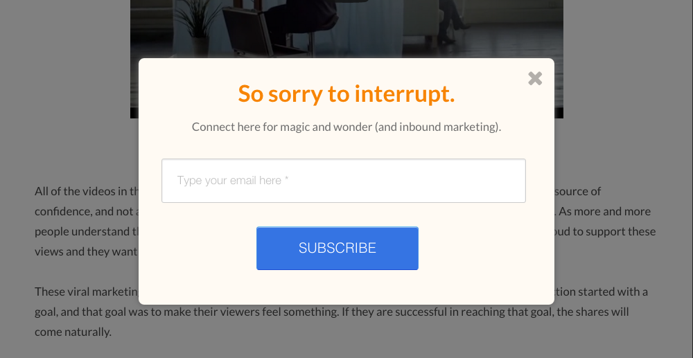
4.) Build your list of subscribers with pop-up HubSpot forms

The more you write great copy, the more you’ll have the opportunity to build your list of readers. You can take advantage of this traffic and have them subscribe to your email list. In our experience what has worked are pop-up messages that speak to your reader has humanly possible.

Schall HubSpot Popup Form

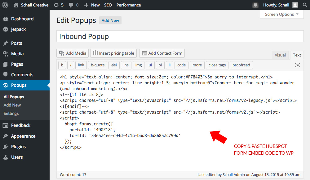
The way we’ve manipulated this was a custom HubSpot form with just an email request with an engaging one liner. This pop-up message is then integrated into blog posts or pages by using the WordPress Popup plugin that was later customized to our needs. Again, all these form submissions are dumped into our HubSpot contacts, and they’re already segmented by which blog they subscribed to. So there is literally no work involved for us–they’re all set up to receive our next email.

Wordpress and HubSpot Form to Create Popup Message

5.) Use HubSpot Contact Forms and embed them in your WordPress site

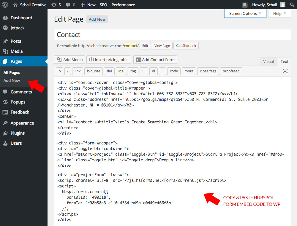
Another great tactic, if not the best tactic, is creating a HubSpot Contact Form and embedding it in your WordPress Contact Us section. When we get a form submission on this page, we know that the lead is at the bottom of the funnel, and closest to “ready to buy.” By using HubSpot, we are able to have an instant notification sent to us so we can follow up with a phone call right away.

This setup has been our most successful approach thus far as we’re able to gauge immediately where our visitors are at in the buying process.

If you need help customizing your HubSpot forms so they match the look and feel of your website, we can help with that. Click here and shoot us a message!

Embed HubSpot Form to WordPress Pages

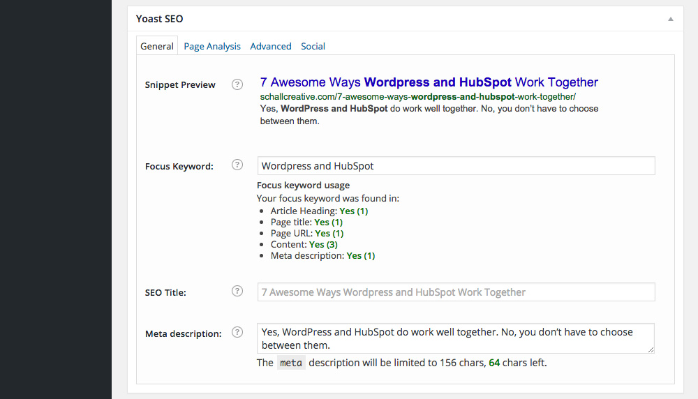
6.) Optimize your blog articles with Yoast and HubSpot Page Performance

The Yoast WordPress Plugin has been around for quite some and it is extremely helpful. The company is constantly updating the plugin and adding new features to improve search results for your WordPress site. I highly recommend it. It will display a guideline on how to improve your blog post and website pages to help you perform better on search results.

Yoast SEO WordPress Plugin

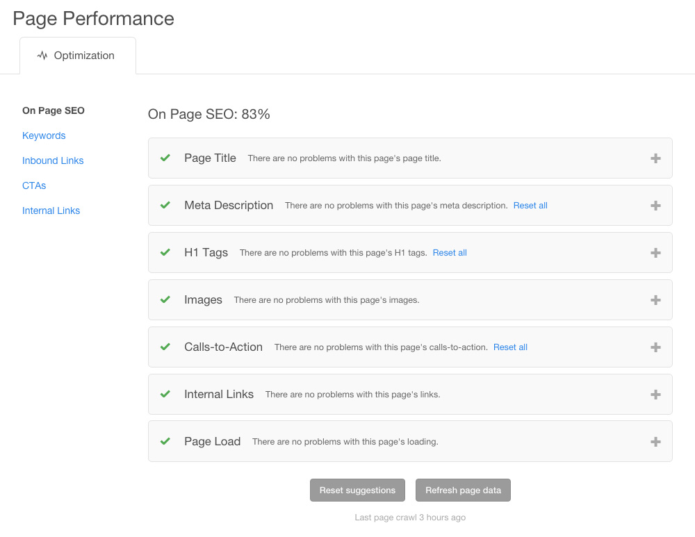
In our case, we do not have our blog posts live in HubSpot. Our blog posts live in WordPress. There are certain features we are not taking advantage of, such as Smart Content, but we still use their Page Performance Tool to make sure all our posts are working to their best ability. Every so often, we’ll check out our blog posts within Page Performance and make the suggested optimization updates. Everything is laid out on one page so we can clearly see which posts need attention.

HubSpot Performance Page Breakdown

WordPress and HubSpot compliment each other well. You don’t have to choose between the two.

Inbound marketing tips and real inbound stories. Delivered biweekly.

Join our community of results driven marketers.

Your Homepage Copy Should Draw People In

homepage copy

If a user doesn’t relate to your web copy, they tune it out. Plain and simple. They’ll easily ignore your homepage copy and just look around for what they need. Or worse, they’ll hit the back button and find something they can relate with.

 
The best thing you can do when writing for your website is to stop thinking about yourself and what you need to say. Start thinking about your potential buyers and what they need to hear in order to make a decision to connect with you.
 
Too many companies think that using big words and corporate speak will make them look more important, and really it just confuses people.
 

Avoid this:

Company ABC is the leading interactive implementors of B2C infrastructures. They enthusiastically enable value-added outsourcing and dramatically utilize value-added functionalities.
 

Keep it simple

One of the biggest challenges I find my clients have with writing is that they struggle to keep it brief. They are so afraid of leaving something out. You need to understand that the buyer’s journey will take more than a visit to your home page, and too much info will end their journey right then and there. Find the text that connects with your user and prompts them to learn more.
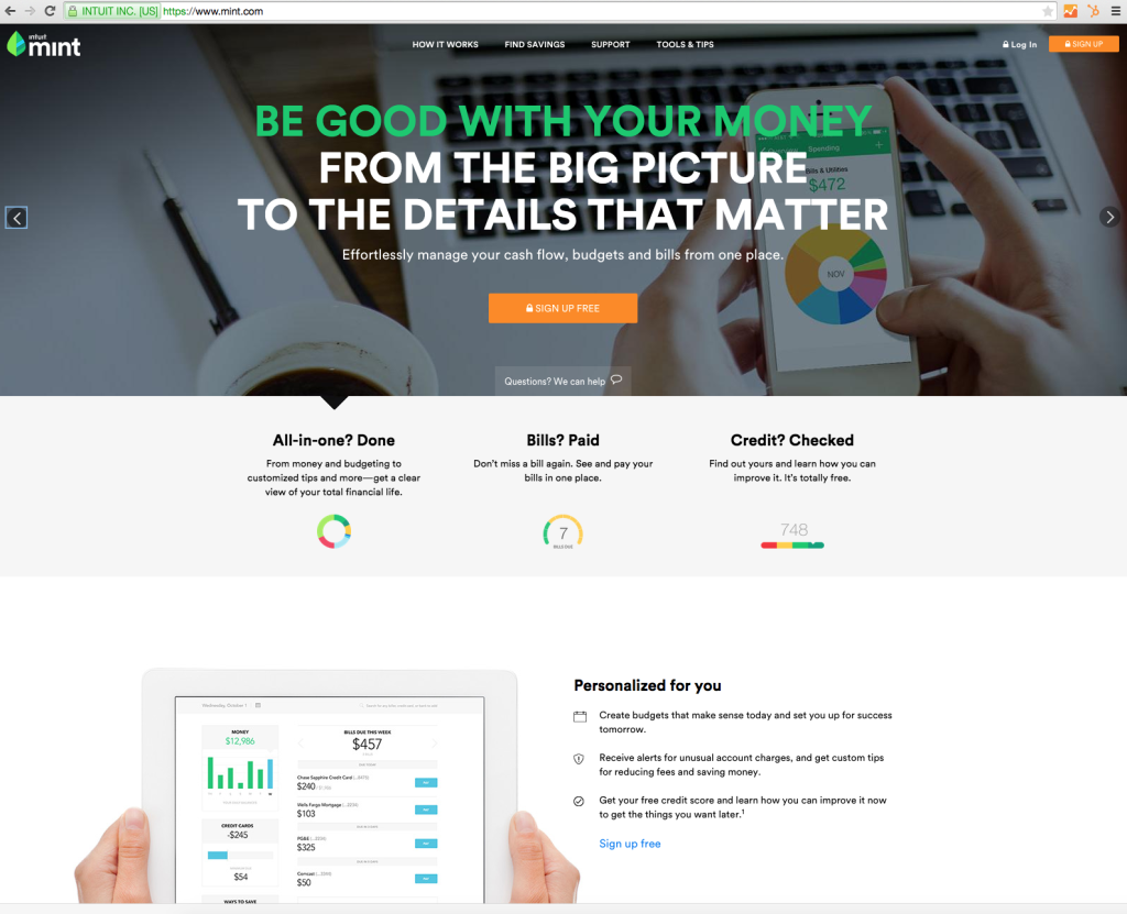
 
Here are some great examples of writing for web:
 

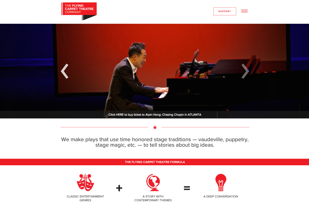
Flyingcarpettheatre.com

home page copy
 
Here’s a subject that seems like it would be complicated to put into words. With the help of some awesome imagery they have managed to keep it in two lines. They even go further and use icons and a “formula” to dive even deeper into the value that they are offering.
 

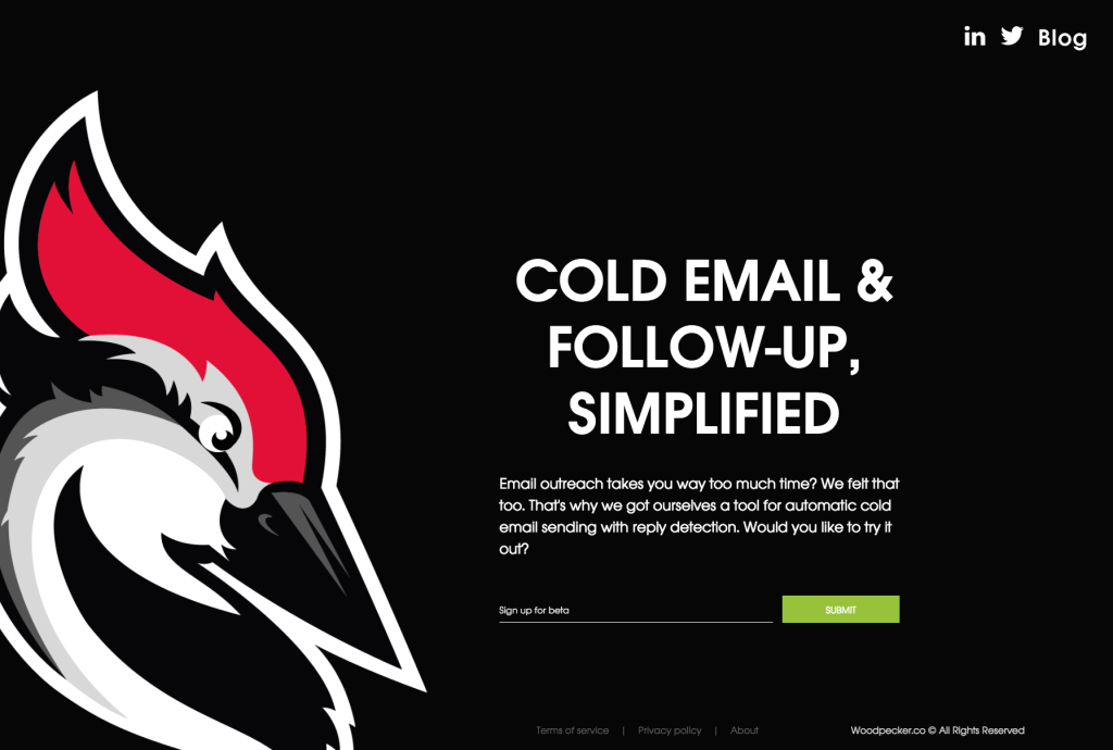
Woodpecker.co

writing for web
 
A great example of a website that speaks directly to the user, one on one. They have really recognized the main problem that their target personas have, and they are letting them know that they had that problem too. Oh, and they created a solution for it.
 

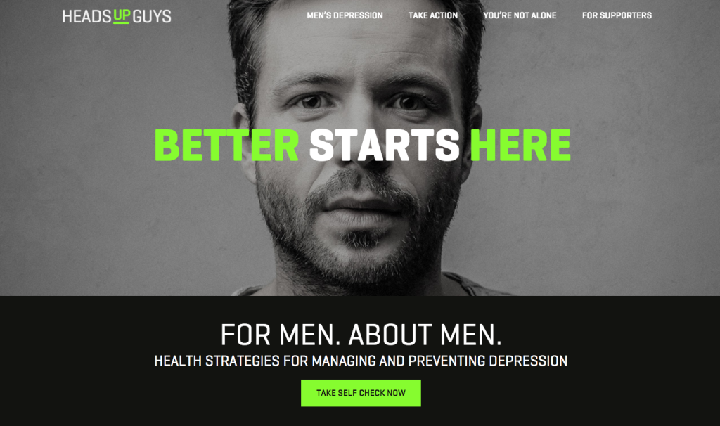
Headsupguys.ca

writing for home page
 
Another complicated topic that can get clouded with too much verbiage very easily. I’m sure there could be a wealth of information once you dig deeper into this website, but the home page tells you what it is without scaring you off.
 

Something to try

When you’re writing copy your homepage copy and having trouble coming up with a description of your company, try asking your clients for help. Pick up the phone and ask your favorite customer what you do for them. Then, ask them why that helps them in their business or life. What is the problem that you solve for them? How do they talk about you in their own words? Use their feedback as a starting point to getting to the copy that your target personas can really relate with.


25 Tactics Great Websites Use


A Great Way to Improve Your Medical Practice Productivity

How to Take Your Medical Practice Administrative Process to the Next Level

In Part 2, Online Patient Forms: How Email Notifications Help Save Time, we went over testing tips when setting up an email and spoke about a few pointers on static and dynamic subject lines.
 
In this article I’d like to share how we helped our client improve their medical practice productivity and increase their bottom line.

The Problem

At the beginning, it was exciting for the practice to receive email notifications of new patients filling out their online form. With every patient that was going online to complete their forms, precious time in the office was spared. This new patient form email would simply be printed, filed, and then used by the doctor at the time of the appointment.
 
The problem was the email print out had a different layout and the doctor wasn’t used to it. He would go to the page to find out vital information and he would have trouble finding it. The new online forms were causing different frustrations and time sucks in the office.

The Solution

We took a look at what the printed forms looked like, and replicated it for the populated online form.
 
We took the information submitted by the new patient form and had the email notification attach a PDF. This PDF was designed with exactly the same layout of what the doctor was accustomed to, and it was then populated with the new patient form information submitted from their website. This entire process is auto-generated every time an online visitor submits the new patient form.
 
Now when an administrator prints the new patient form email attachment, the doctor can find the information where he’s used to looking for it.

The Outcome

• An efficient online patient conversion from the website
• Patients are attended quicker
• The administrative process at the practice saves time and money
• Most importantly, the practice attends happier patients and more of them
 
How have you improved your medical practice productivity? Share at the comments!


25 Tactics Great Websites Use


How Do You Measure the Success of a Website?

What does it mean to have a successful website? In the past, having a website that worked and looked good may have been all a company was really looking for. But in 2015 a website can and should do much more. A company needs to set standards for what their website strategy will do and how it will affect their business.
 

The success of a website depends on your measurement for that success. This means you need to set some goals. These goals should be Smart, Measurable, Attainable, Relevant and Time-Bound. You need to set some SMART Goals.

 
Of course, you can set some more specific goals for things like organic traffic, social media reach, or average visit duration, but the three main metrics you want to look at when setting SMART Goals are traffic, leads and sales.
 
Start by looking at your current position. What’s your website’s current traffic? How many inbound leads are you getting right now? How many sales are you closing from inbound leads?
 
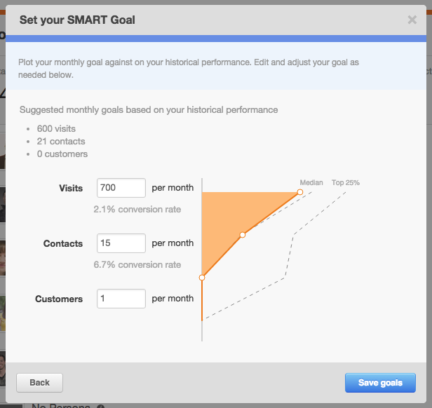
HubSpot has a great tool where you can set your SMART goals right on your dashboard. When you input your numbers, it compares your goals to the median and top 25% of HubSpot users.
 
HubSpot SMART Goals
 
Here are a few more helpful statistics you may want to take a look at to help you in this process. Of course these stats were gathered from a wide range of businesses and industries, so be sure to take that into account.
 
• SEO leads have a 14.6% close rate, while outbound leads (such as direct mail or print advertising) have a 1.7% close rate. (Search Engine Journal)
• Content marketing generates 3 times as many leads as traditional outbound marketing, but costs 62% less. (Demand Metric)
• Only 25% of leads are legitimate and should advance to sales. (Gleanster Research)
 
If you haven’t been collecting data up until this point, you’ll need to make sure your goals make sense when compared to how you currently bring in business. Once you have a few months of analytics, you can make some changes to your goals.
 
Your SMART Goals can and will change over time, but it’s important to always have them and to keep improving. Successful inbound marketing takes a lot of work, and it does take time. Having and hitting your SMART goals will help keep you motivated.


6 MARKETING METRICS YOUR BOSS ACTUALLY CARES ABOUT


5 Tested Website Features that People Trust

5 Tested Website Features that People Trust

In business, when you meet someone in person you can use your judgement to decide if you trust them. When you visit a website, on the other hand, it can be sometimes challenging to feel that same type of trust.
 
The goal of a website might be to create awareness, be descriptive and to sell a product or service. But what is it exactly that makes an online visitor reach out to you, become a donor or convert into a customer? How do you create a website that people trust?
 
Here are 5 website features that people trust:

1.) Valuable Quality Content

A well put together article that solves a problem for your audience will always be memorable, especially if that article saved that person time and money. It creates credibility, it makes a person feel attended and can resonate to such a degree that they feel the need to share it. The ultimate power of quality content, especially if it brings value to your audience, is that it remains online until you remove it. 5 years can go by and it will still be helping someone solve a problem. Being a problem-solver makes your website trustworthy.

2.) Personalized Photography That Shares Emotion

Quality commercial photography plays a large role in creating trust in a virtual experience. Choosing between stock photography and commercial photography that is tailored to your business makes a huge difference. Images that share how you do business and how you interact with your clients gives your first time online visitors an idea what to expect. By sharing faces of the staff and images of your facility, creates a peace of mind before setting foot into your place of business. Especially if someone is coming from a distance. But the real magic happens when images share personality, culture and emotion.

3.) Videography with an Exceptional Storyboard

There isn’t a better way to welcome your visitors into your world than through video. Video gives organizations the opportunity to introduce themselves to the public. It also gives the opportunity to take an online experience to the next level by sharing expression, a way of (business) life, and the ability to find out if there’s a good fit or not. A well done video with an exceptional storyboard can become memorable. It can lock your audience’s attention immediately and has the ability to give you a head start with trust.

4.) Social Media that Shares Company Culture and Thought Leadership

Nowadays, many professionals go through company social media channels such as; LinkedIn, Facebook or Twitter, to discover a type of mindset. A typical audience behavior would be to check if a business is active on social media and if so, what type of information are they sharing and do they know their stuff? These social media channels give the opportunity for organizations to become thought leaders in their industry. This ability of sharing knowledge or culture creates credibility and adds more trust to the pile.

5.) A Beautiful Website Design

Regardless of all marketing investments, your audience will end up on your website. A well designed website is a tremendous factor in building trust, especially for new business. A website today needs to deliver an effortless user-friendly experience from a desktop to a mobile device. Information needs to be extremely easy to find and the flow of the site has to be welcoming. A structure of quality copy, colors, spacing, typography, icons, photography, and video must live in flawless harmony. Last, in order to stand out from the rest, there needs to be a defined style that’s true to the brand.
 
A great website goal to aim for is to create trust through a virtual experience. I hope these five features can take you there.


25 Tactics Great Websites Use


Success Story: Healthcare Website helps bring in 40 New Patients

Success Story: Healthcare Website helps to bring in 40 Patients in Five Months

Palliativity Medical Group was starting from scratch. They had no brand recognition, no online traffic, no voice and no preexisting website. They came to Schall Creative and hired us to build their new healthcare website.

15 Patients in less than 2 Months.

40 Patients after 5 Months.

200 Patients after 1 Year.

About Palliativity Medical Group

Palliativity Medical Group is a Palliative Care medical practice, providing specialized medical care for people living with serious and/or chronic illness. They focus heavily on increasing the quality of life for their clients and their families by managing physical and existential pain, as well as many other symptoms of their acute and chronic illness.

Challenges

Before starting with Schall Creative, Palliativity Medical Group had a bad experience with their previous marketing company. When the relationship started to go sour, they decided to start searching for a new web agency. They needed an agency that listened to them to create the online version of their unique practice.
 
Palliativity Medical Group wanted their website to be exceptional. They needed their online presence to not only fulfill their needs but their patient’s needs as well.

Building a Website That Creates an Impact

Palliative care is a very personal situation where their needs to be trust. We made sure the website delivered that immediately by displaying pictures that captivated genuine human emotion. We wanted to make sure that a future patient was able to experience who Palliativity was, before picking up the phone or visiting their facility.
 
If it takes too long for an online visitor to find contact information on a website, it becomes frustrating. It’s very easy for visitors nowadays to move on to the next website. Therefore, a phone number and contact form visible at all times was vital.
 
Last, well structured on-page SEO was key. Healthcare websites can be beautiful and have great usability but they need to bring in new patients. We made sure this healthcare website performed as their online 24/7 sales team and brought results.
 
As a new medical practice, their initial goal was to have 15 full time patients. We were happy to hear that with the help of their online presence they are very close to hitting that goal only 2 months in. Five months later, they are at 40 patients.
 
While taking a look at their organic traffic, we noticed that not only is it steadily rising, but the people who find them through Google are spending a lot of time on the website. This means that they are finding what they are looking for, and they are taking the time to read through and learn about the practice.
 
This was a great project to work on, and seeing these kind of results a few months later is what it’s all about for us.


25 Tactics Great Websites Use


Why target= “_blank” is your friend. External links should open in a new tab!

Why target= “_blank” is your friend. External links should open in a new tab!

Attention online publishers! If you are linking to a source within your content you need to make sure said source opens in a new tab. No excuses. Here’s why:
 
Think about the experience of a reader. They are really into reading your article when you reference a video you watched that has another example of what you’re writing about. Now, they’re really into this topic, so of course they want to watch that same video that helped inspire you to write about it. So they click, and they watch the video. Three minutes later, the video is over and they’re satisfied. They close the tab and think about getting back to your original article. But the article is gone. Now, if they want to get it back they can go into their history and look for “recently closed tabs.” But this adds another step to the process, and they are a tiny bit frustrated that you didn’t make sure that link opened in a new tab. So they go back to twitter and carry on with their procrastination.
 
Unless the main goal of your article was to get people to view the video you linked to, you’ve failed.
 
If you made sure the link opened in a new tab, the user would have watched the video, hit ctrl-W to close the tab, and finished your article. At the bottom of your article a place for them to convert into a subscriber, and they do. If this is your goal, then you’ve succeeded. You did a great job paying attention to the details.
 
If you are adding a link through the code view of your website, you need to add target=“_blank” to your code. After your link, and before the tag closes. If will look something like this:

<a href=”thisisalinkyouwanttoreference.com” target=”blank”>This is your link text.</a>

If you’re adding a link in WordPress, they have a handy dandy check box that says, “Open link in a new window/tab.” Just check that off and you’re all set.
 
I tend to have a link open in a new tab about 85% of the time. If it’s a link that is the next step of the journey I want to take them on, like a call to action, then I’ll have it open in the same tab. If the link is inside your content (like a word in a paragraph) it should ALWAYS open in a new tab. If it’s a button or a graphic that you want them to click on once they are ready, and they will have no reason of returning, then you can just have it replace that page.
 
It’s all about paying attention to how the user will consume your content, and making sure all the details work towards your goal.


25 Tactics Great Websites Use


How to overcome a bad experience with a marketing agency

How to overcome a bad experience with a marketing agency

There are lots of different types of marketing agencies out there. And they all have different skill sets. The world of marketing can also be hard to understand for someone outside of it, and a company having a bad experience with a marketing agency is unfortunately not uncommon. But in order to survive in the business world, you can’t sit on the sidelines and never work with another marketing agency. Here’s how to bounce back and find a marketing agency you can trust.

Talk about it

When you are looking into working with a new agency, make sure to talk openly about what went wrong with your previous marketing agency or web development firm. Whatever the situation may have been, make sure the new agency understands where they would need to focus on to avoid the same issues.
 
Once the new agency understands what went wrong, ask them how they would avoid similar problems. Have them give you examples of how they overcome the same types of issues with their current clients.
 

Take Baby Steps

Try starting out with smaller project to test the waters. This way both parties get a feel of how each other works. Is the agency attentive? Do they meet deadlines and do they roll out efficient, quality work?
 
Let’s face it. Even though there is a great connection at the beginning between both parties, you need to understand if everyone can work well together. And, as an agency, we need to understand if the client likes how we work.
 
As digital marketers, we constantly talk about how there needs to be “the right fit” to do business.  The truth is, we don’t know if business relationship is “the right fit” until after the first project.
 
It’s difficult to build trust with a new digital marketing agency or website development firm but if you do your research, always have clear communication and take baby steps, it’s easier to establish a base without getting disappointed.
 
Have you had a bad experience with a previous agency or web development shop? What helped you or your company decide to work with the new agency?


25 Tactics Great Websites Use


What to Do When You See Your Website has “Bandwidth Limit Exceeded.”

What to do when you see your website has "Bandwidth Limit Exceeded."

What to Research Before a Website Rebuild

What to research before a website rebuild

Rebuilding a website is exciting, but it can also be quite stressful. It’s important to start off the process on the right foot so you can avoid headaches down the road. Here are a few things you should research before a website rebuild.

Get the technical stuff out of the way

You’ll be surprised how many companies do not know their domain or web hosting username and password. Make sure you have these credentials handy as you’ll need them to update your website. If you have an IT department or have someone who does your IT work, he or she would have this information for you. IT can also fill you in on what your email hosting situation looks like. Is the email hosted on a local server or is it a third party service. Emails can get messy and sometimes lost so these are great conversations to have before hand.
 
Also, let your new web development company know if you’re looking for a new hosting company. Most likely they can supply that service for you as well. I would suggest to ask about the security of the hosting service as spam and malware is a nightmare these days.
 

Review Your Online Traffic

If you are keeping in track of your website traffic with Google Analytics, take a look at it. Try to find out your top visited website pages and look for pages where visitors spend the most time. This can give you an idea what your online visitors are interested in. You can dig in quite a bit to your online data, but at the very least try to get a high level understanding of what your online visitors are interested in on your website today.
 
If you are not keeping in track of your website traffic, start tracking immediately. It’s better to have some traffic data than no data.
 

Ask For Input

Depending on the size of your company, you may need to have a talk with your sales department and ask them what they would like to see as an improvement in the new website. Reach out to the administrative department and ask them a few questions as well. Most importantly, listen to your audience and find out if your clients are struggling with the current website in any place, shape or form.
 

Conduct a Website Survey

By putting together a survey with a series of questions can help you to decipher what’s needed. You can use a third party service like SurveyMonkey to put something together. Ask questions like, “Why do you visit our website?” and “How well does our website meet your needs?”.
 
Now if you have the resources, you can create an online form that could live on your current website. After completed and submitted, the form can then email you the client’s feedback. You can always ask your current web development company to help you put something like this together if things get a bit tricky.
 

Speak with the CEO

You’ll need to make sure that whoever is managing this project has a clear view of the company’s goals. Find out the goals first, then start thinking about how your new website can help make them happen. Make sure to have a discussion with your CEO and find out their point of view. Their opinion should have less to do with what the website looks like and the content that’s on there, and more to do with bigger picture company goals.
 

Find the Right Web Agency

To find the right web agency it is never easy. It helps if you have a budget in mind before you start looking. Putting out a generic RFP with no idea of budget can lead to trouble. We recently heard a story of a client getting quotes back that range from $5,000 to $75,000. Three months went by and they still had no idea who to work with.
 
There are many stories like this one but at the end of the day there needs to be the right fit. The right fit starts at the web company’s portfolio. There’s nothing written on taste but take a look at that portfolio and get a sense of the type of work the web firm has done. Take a look at the type of clients they’ve worked with. I would suggest to review their social media channels such as; Facebook, Twitter and LinkedIn. This can give you a sense of what their culture is like. You never find a bad client testimonial on a web company’s website but if you find recommendations on LinkedIn, I would look at those as brownie points. Last, look for success stories the web firm as shared from their existing clients.
 
I hope these research tips help you rebuild your website the right way, with the right web company, the first time around.
 
What research tactics have you used to help rebuild your website? Share your insight at the comments!


25 Tactics Great Websites Use


How Dynamic Online Patient Forms Can Save Your Medical Practice Time and Money

How dynamic online patient forms can save your medical practice time and money

When you’re feeling sick, achy, or are in pain the last thing you want to do is fill out a long patient form while waiting to be attended. 15 to 30 minutes can go by and that person maybe still waiting in pain.
 
We have noticed that many medical practices aren’t taking full advantage of their website to improve their administrative process. A well built website can help your office with everything from scheduling appointments to completing new patient forms that integrate with your current system.
 
Here’s how we helped our client save time and money at their medical practice.

A Secure Online New Patient Form

Online patient forms can be long and extensive. We wanted to make sure the online experience went smooth for new patients, so we created an online new patient form that was dynamic. This means, depending on the new patient’s response to a question, he/she is prompted more options. For example, “Are you allergic to anything?”. If the answer was yes, it would display more options. If the new patient selects no, he/she could just move on to the next question.
 
For our client, hacking and spamming was a major concern. We wanted to make sure our new patient’s information was submitted safe and secure. Therefore we made sure the online form was secure and followed all guidelines. This created a peace of mind for everyone.

Administrators Notified By Email

Once an online new patient form was completed and securely submitted, all assigned staff members received a notification by email. With all the junk email going on these days, we wanted to make sure the email subject line was descriptive. By adding the new patient’s first name and last, the staff knew who the new patient was before opening the email.

Taking the Practice Productivity to the Next Level

With time we discovered our client receiving an email notification with patient information wasn’t doing all it could do to increase the practice’s productivity. The print out of the email notification became confusing for the doctor to review because it looked different from the forms their patients filled out in person. Therefore finding information for the doctor became challenging and was creating confusion.
 
Our solution was to include an attached PDF with the notified email. We then match the design of the new patient form print out used at the practice. Now, once a new patient form is securely submitted, the new patient’s information is dynamically laid out in an attached four page PDF matching the practice’s new patient form print outs including HIPAA compliance.
 
This website feature is now saving time in the administrative process and saving precious appointment time. At the end we have happy patients and an efficient medical practice.
 
How were you able to increase productivity at your practice? Please feel free to share your experience below.


25 Tactics Great Websites Use


How Important is Responsive Design for Your Website?

How Important is Responsive Design for Your Website?

Responsive Design: How important is it really?

You may have already heard of Google’s Mobile-Friendly update by now. This recent update, which many are calling Mobilegeddon, can hurt your search rankings if your website is not responsive. If you’re curious to see how your website is performing mobile wise, you can find out by using Google’s Mobile-Friendly Test Tool. The tool will give you a pretty good idea if your company website needs improvements or not. At the end of the day, if you’re company website is not responsive, chances are your visitor will simply leave and find your competitor that is.


The responsive design concept for websites in nothing new. Terms such as; liquid structures, fluid grids, percentages and ems have become an attraction for years now. Here are a few reasons why it’s important to have a responsive design:


1.) Say Goodbye to Creating a Website Per Device

Stop the madness! Do you have any idea how many different types of mobile devices are out there? I can’t even imagine building a website for each one. It’s just crazy to think how much production and expense that would be for our clients. Not to mention when new devices come out, will you need to create a new website for that as well?


2.) Retain Your Mobile Visitors

We can talk about mobile vs desktop stats all day but the fact is if your website is not mobile friendly you are losing business. How long does it take your first time mobile visitors to call you, find your address, or learn your operating hours? If you are selling products, how quickly can your client buy through a mobile device? It’s time to retain that mobile traffic, and gain better qualified leads through inbound marketing, and increase those sales instead of losing them.


3.) Flexible Across the Board

The issue is there’s always going to be a new touch screen device where the screen size varies. The bright side is their shapes do not vary. There are no mobile devices that are circles or triangles… last I checked at least. For now, it’s safe to say they are all rectangle. One less thing to worry about. I have to admit, this is probably one of the features I enjoy the most. The ability for images to enlarge or scale down when they need to, menus disappear and simplify into small boxes and grids morphing and adapting to a portrait or landscape positioned mobile device.


4.) Mobile Experience is Crucial

This is the age where simple, efficiency and ease of navigation is key. Having the ability to scroll through content and being able to call directly without typing in the number is key. A one click (two max) access to more information or to buy is key. Big, finger-friendly buttons and large fonts… is definitely key.


5.) Better Search Results

Last, if one of the main goals for the organization is to be visible on Google or to improve search results, then having a responsive design for your company website is a must. As I mentioned earlier, Google is giving out brownie points if your website is responsive. There are other elements that come to play for achieving a great mobile experience such as; image optimization, download time, and compressing CSS and JS files. Ultimately, if the responsive design talk is on your to-do list, you’re off to a great start.

 
What other benefits do responsive design websites have? Share your opinion with us in the comments!

 
If you’re rebuilding your website, please feel free to download our free ebook with helpful tips on how to get started.


25 Tactics Great Websites Use


How to resize images using WordPress

How to resize an image using wordpress

Have you ever uploaded an awesome photo to your WordPress website or blog, and then have it take 12 seconds to load on the page? Or maybe you’ve wanted an image to take up more or less space on the page. You can do these types of edits right in the backend of WordPress. So here’s how to resize images using WordPress.

 
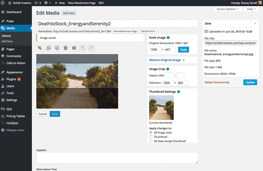
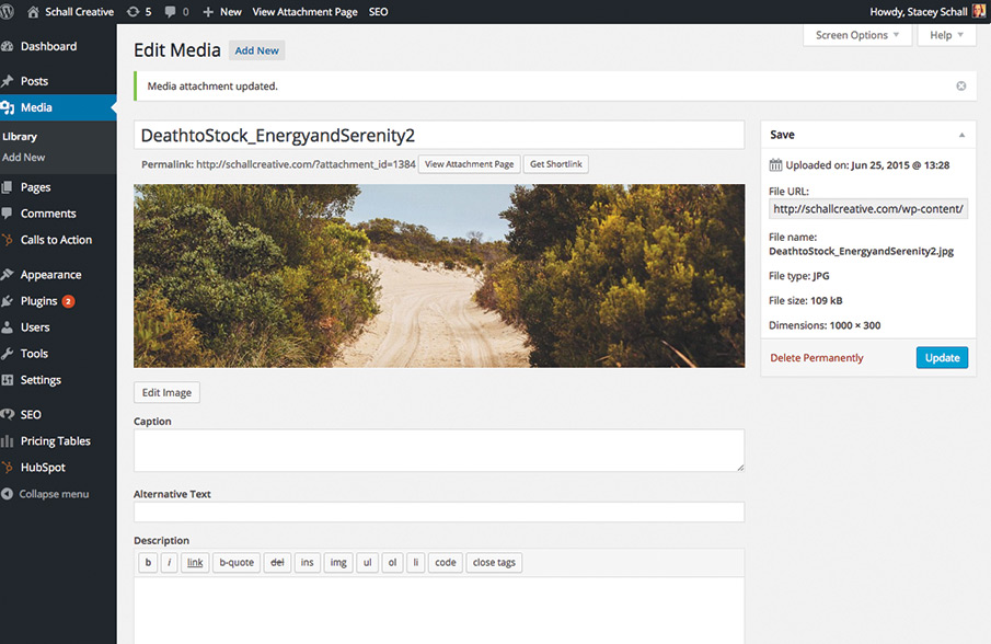
First, here are some basics. When we talk about image size, that means the space the image takes up on the screen. This is measured in pixels. Although they range, a common width of a website is 1000 pixels. So if you’re creating a banner image that needs to go across the entire width of your text, you might make something that is 1000×300 pixels.
 
The image file size is how much the image weighs. This is measured in bytes. Specifically in web design, you’ll be measuring Kilobytes or KB. If you upload an image and the weight of that image is being measured in Megabytes or MB, then the image is much too large.
 
So how do you know what size your images should be?
 
A large image, like a banner or something that takes up the entire width of your text, should be between 60K and 120K. A small image that is within your text should be 50KB or less.
 
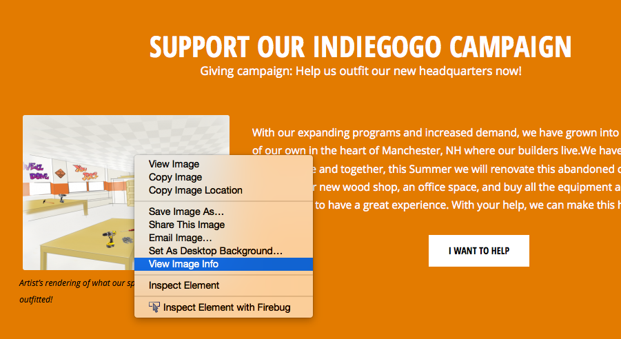
Pro Tip: If you’re using Firefox, when browsing the internet, right click on any image and go to “view image info.” A window will pop up that shows you the dimensions and the weight of that image.
 
View Image Info
 
Image Info
 
You can quickly check the size of your own images using this trick to make sure they’re how you want them, without having to log in to WordPress.
 
So, now how do you edit an image to make it your desired size and weight? You don’t have to have access to photoshop to get this done if you’re using WordPress.
 

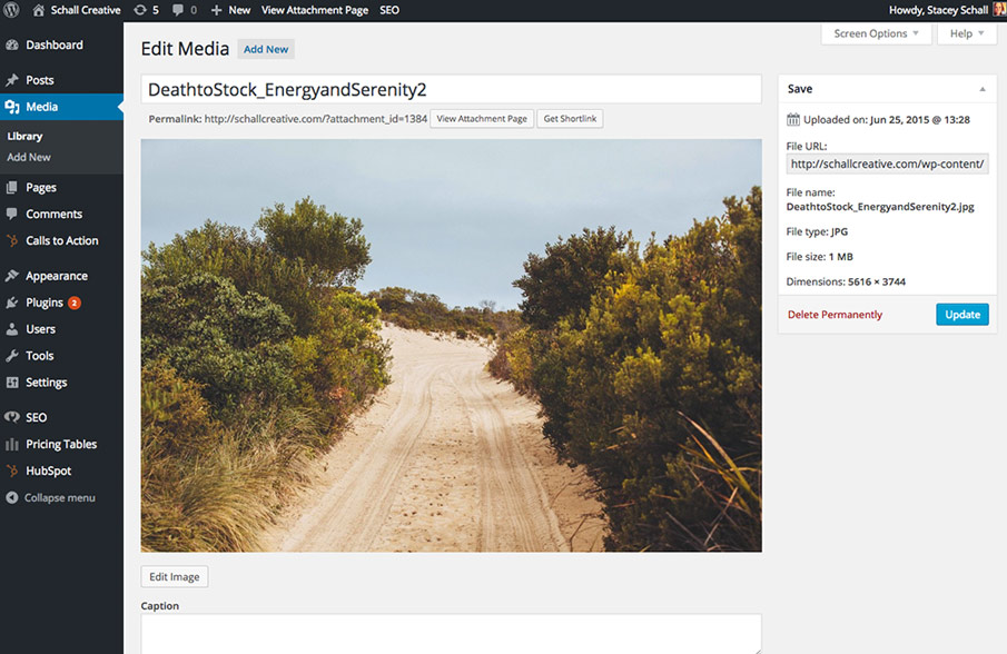
1. Upload your new media.

In the Media section, simply drag and drop or select a file from your computer. Once it’s there, click “Edit.” The image I chose is over 1 MB. Way too big.
 
Upload image
 

2. Scale the image.

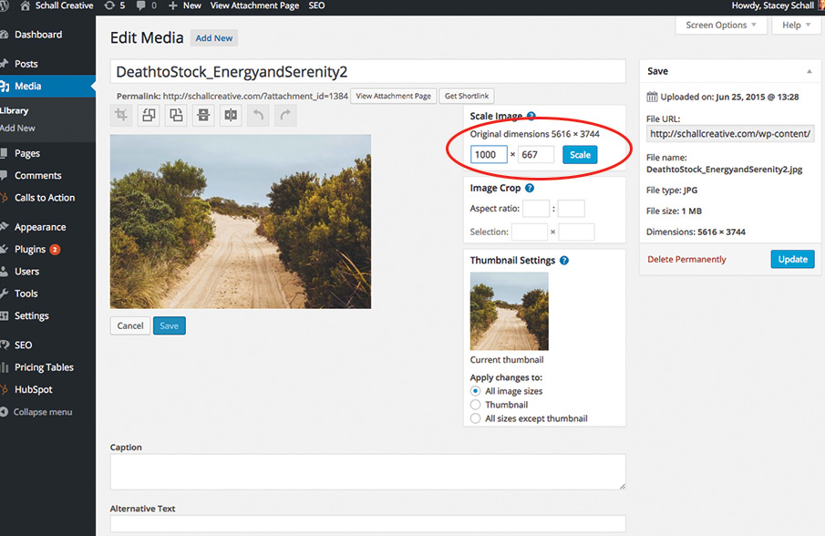
Click Edit Image and scale the image to your desired width. In this case, I made it 1000 x 667 pixels.
 
resize image
 

3. Crop the image.

I also want to make sure it’s only 300 pixels high, so I’ll use the crop tool. I click and drag the section of the photo that I want to keep. It will tell me the size of my selection in the image crop box. Click the crop tool to make this happen.
 
Crop image


Then hit save and then update. You’ll notice that my file size changed dramatically when I made these updates. It’s now 109KB, a perfect size for a banner on my blog post. If yours still weighs too much after it’s cropped, you may have to compress the image using a third party software.
 
resize images using wordpress
 

4. Insert the image.

Now, when you go back to your post, you can insert the updated image.
 
And that, my friends is how you resize images using WordPress.


25 Tactics Great Websites Use


Google Trends as a Keyword Research Tool

Google Trends as a Keyword Research Tool

You don’t need a bunch of paid fancy tools to do basic keyword research for your website or blog. Google Trends is a great introductory keyword research tool for any business owner that is producing and posting their own content.

 
When you’re creating a blog post, you want to make sure the terms you are using match the terms that people are searching for. Since sometimes you can present yourself using a number of different terms, it’s a good idea to use a keyword research tool. For example, when we became HubSpot certified partners, we thought about changing the wording on our home page from “Digital Marketing Agency” to “Inbound Marketing Agency.”
 
Within Google trends, we went to the Explore Tool. Here is what we found:
 
Google trends digital marketing vs. inbound marketing
 
While the Explore Tool doesn’t give us hard number as to how many people searched for these terms, it can push us in one way or the other when we can’t decide which term to use. In this case, the clear winner is “digital marketing agency,” so we kept our main page titles as they were.
 
The “inbound marketing agency” traffic is growing and it’s not a term we will ignore, we just will focus on it with our blog content rather than the home page of our website.
 
The tool also points out major news headlines that could have contributed to a rise in traffic for that term. Other interesting features are how much regional interest there are in those terms and what some related search terms are.
 
Google trends can also just be used if you’re curious about what people are searching for. It gives real time information about the top searches. It’s pretty easy to get lost down the rabbit hole when using this tool, so be careful of that if you’re on work time.


Learn how to rank above your competitors


Developing a Marketing Budget when Outsourcing Marketing

developing a marketing budget

When it comes to marketing, there are no one-size-fits-all strategies. Every strategy needs to be customized depending on the goals and needs of the company. Just like the strategy, a company’s marketing budget also needs to be highly customized.

Marketing budgets tend to be somewhere between 2% and 20% of gross annual revenue. That’s a big range. How does a company decide on their number? Here are some things to take into account when developing a marketing budget.

Organize and Analyze

First, you want to take a look at your efforts so far. Figure out what percentage you spent on marketing in the past few years. Has that number stayed steady, increased or decreased? What has been the outcome and how does it correlate with your sales numbers? If you’re able to track the performance of specific campaigns, that’s great. If not, then start tracking. The best data you can look at when planning is your own.

Time

You also want to take into account how much time you and your staff has spent on marketing. You may only be paying a couple bucks a month on email marketing, but maybe it takes a staff person 10 hours to create and send an email campaign, and another 2 to analyze and report on it. If that’s something you would like to take off of your staff’s plate and outsource, make sure you take that into account when developing a marketing budget.

Goals

Make sure you have clear, time oriented goals. If you just want to grow, that’s not enough. Everyone wants to grow. How much are you going to grow by? What does your growth plan look like for the next 12 months, and how much money and time are you going to put in to get there? What is your ideal return on investment?
 
Once you have your numbers set, the next step is to find a marketing company that you can trust, and share these numbers with them. If they are the ones coming up with the marketing plan, they need to know your goals and your budget. This isn’t only so they can come up with the best plan, but also so they can measure their efforts effectively. When you outsource your marketing, the relationship should be transparent on both sides. You will need to share your vision with your marketing team, so make sure you are comfortable with them at the get-go.


25 Tactics Great Websites Use


What to discuss with your CEO before hiring a digital marketing agency

Hiring a Marketing Agency

There’s a common situation that tends to happen when organizations are ready to make a change with their marketing efforts. It could be that the year is ending and it’s time to reevaluate those numbers. You’ll want to figure out if your marketing dollars were well spent and what the outcome was. What channels were most productive and which ones failed miserably? How do we exclude the noise and determine a strategy that will give us efficient results? What would it take to achieve those results?


When we first sit down with a VP of Marketing or Marketing Manager, our questions are centered around the organization’s goals. If the person in charge of marketing is not included in company goal discussions and are not prepared to answer these types of questions, we will assign them homework so that we can discover together if their organization is ready to hire a digital marketing agency like us. 

If you have been given the task of hiring a digital marketing agency for your company or organization, discuss these things with your CEO first. Marketing is not just arts and crafts, so don’t be afraid to get that CEO involved.

Contractor or Partner

When thinking about hiring a marketing agency, does the organization need a contractor or a partner? Are you explaining your goals and challenges, and counting on an agency to get you there? Or do you know exactly what needs to get done and you just need someone to execute.

CEO Vision

The marketing team needs to have a clear idea of what the CEO envisions for the company. What would their ideal marketing partner do for them? If you don’t know this, you run the risk of allocating a lot of time and effort vetting out a company that the CEO doesn’t want to partner with.

Budget

Some organizations will tell their marketing team to go out and get a bunch of quotes. But you want to make sure you know your ballpark before you contact an agency. Some questions to ask your CEO would be; How much did we allocate to marketing last year and to which channels did that investment go? Are we looking to cut expenses or become more aggressive? What amount of sales are we looking to bring in from our website or inbound marketing campaign? These are key questions that will save everyone time.

Timeline

It is helpful to know what the CEO expects in regards to timeline. For some organizations there is an urgency to go live due to upcoming events or recent changes. Others just want to make sure it’s done right. A clear understanding when a project should start and when it should launch is vital.

Expectations

Last but not least, what are the CEO expectations for the hired marketing efforts. You would be surprised that by the time the meeting takes place, no one in the room has a clear focused answer on what the organization is looking to achieve. You could be aiming for retention, increasing traffic, more leads, higher conversion rates, better qualified leads, brand recognition, more sales, or all of the above. What percentage does the organization want to increase these by? Make sure this discussion takes place with your CEO. This way your future marketing partner gets a gauge on how aggressive they would need to be to meet the demands in the ideal timeframe.
 
Before you schedule your first meeting with a marketing agency, make sure you have these things ironed out. A qualified agency shouldn’t be giving you a proposal unless they know the answers to these questions.


25 Tactics Great Websites Use


One time SEO vs. ongoing SEO

ongoing SEO vs. One time SEO

Just like everything on the web, SEO is changing. What used to be reserved for developers and programmers is now the job of a great content writer and a content management system.

What’s the difference between one time SEO and ongoing SEO?

One-Time SEO
SEO done one time is usually done at the launch of a website. Using keyword research, you can find out which keywords you’d like to rank for and make sure each page of your site is optimized appropriately.
 
Depending on your market at the keywords you want to be found for, it can be effective to let a site simmer for a few months after these initial SEO efforts. However, in most cases, you’ll need to hit the ground running and start with some ongoing SEO.
 
Ongoing SEO
In the past, ongoing SEO has been more technical. It also used to be what we now consider spammy. Your webmaster would keep up with Google algorithm updates, and build links. The more links you had pointing to your website, the better your site would rank. SEOs would list their sites on directories and link lists wherever they could find them. Some would even build complex networks of websites, all linking to each other to try to outsmart Google.
 
Create Great Content
Now, the way to practice ongoing SEO is through creating great content. It’s done by knowing your customers, knowing their problems, and offering up solutions on your site. The more great content you have, the more potential search terms you can be found for.
 
The more focused your content is, the better chance you have of ranking. Nowadays, a common human behavior is to ask Google anything and everything. So, if you get to know your audience, and understand their problems, you have a starting point to figure out what they’re searching for.
 
The Technical Side
There is still a technical side to ongoing SEO. You want to make sure you are using all the best SEO practices when you publish your content. You start with the key phrase you want to be found for, and place it in the URL, title, content and alt tags. Then, you want to monitor its performance. By taking a look at your traffic you can decide if you need to update a post.
 
Other forms of ongoing SEO involve taking an audit of your site. We use a tool called Raven here at Schall. Their site auditor tool crawls our sites once a month and comes back with all the things we can do to improve their performance. Moz also has a great blog post with instructions to perform your own site audit.


Learn how to rank above your competitors


The Simplest Keyword Research Tool

keyword research tool

When writing content for your website or blog, your first step is to think about your user and what they might be searching for. What are their challenges, and how can you help them? It’s a good idea to do some keyword research to ensure the term your optimizing the page for matches up with the term people are searching.

If you don’t have the time or resources to conduct thorough keyword research, try just using google itself.

Based on the search data in your area, Google give you options to auto fill your search query. It also takes into account what you’ve searched for in the past, so it’s best to use this tactic in a private browser.
 
Here’s what it will look like:
 
keyword research tool
 
If you’re unsure of how people are searching for your service, just type a few of the key words into the search bar and take a note of what comes up.
 
To take it a step further, try Google trends. The explore tool lets you see the trends over time for any keywords. It also shows you the regional interest, and even compares them to other similar terms. Of course, neither of these tools give you real numbers of how many people searched for these terms, but it can help point you to the right direction in your keyword strategy.
 
Here’s an example:
 
Google Explore Tool
 
If you’re looking for a more in depth way to plan your keyword strategy, I recommend taking a look at the resources on moz.com, especially their beginner’s guide to SEO. You can find the chapter on keyword research here.


SEO Competitive Analysis


Writing Website Content – Ask Yourself These 4 Questions

writing website copy

Are you having trouble writing website content? Ask yourself these four questions.

Will people know what I do within seconds?
Will they understand what page they’re on and what it’s about?
Will they know what to do next?
Why should they buy/subscribe/download from this site instead of from someone else?
 
When writing website content, try to put yourself in the users shoes. If that’s difficult, ask someone else to be the user and ask them if they can answer those four questions.
 
As marketers, the best thing you can do for your product is to start by forgetting about your product and focusing on the user and what they are looking for when they land on your website. It’s tempting to talk about all the features of your product, but you need to resist. Because, guess what? It’s not all about you. That sounded harsh, but let me explain.
 
Mint is an application that helps people manage their money. Here is a look at their home page today:
 
writing website content
 
I spotted the word “you” or “your” about a dozen time. There is no mention of “we” or “our product” anywhere. This is because it’s not about them.
 
This website also does a great job with what would be my next two suggestions.

Create a few headlines and sub-headline ideas for your most important pages.

To combat question #4, (why should I buy from you?) use a powerful value proposition and steer clear from generic cliches, gobbledygook terms and corporate speak.

Make sure to include clear call-to-actions and next steps.

Include links in your body copy, next step links at the end of the copy and calls-to-action wherever appropriate. Include a little direction and you’ll be glad you did.


25 Tactics Great Websites Use


Building a Website Using HubSpot CMS Review

HubSpot CMS Blog Banner

It wasn’t until early 2015 that our agency was approached to build a custom site on the HubSpot CMS. I have to admit I was curious, but also a bit pessimistic about it’s capabilities. I’d gone through a quick demo of the product a few years prior and I hadn’t been all that impressed.
 
This time, when I started doing my research and after trying out the platform, I could tell that they had reevaluated their system and spent some time on the product.
 
Hubspot CMS Template Builder
 
Being a Joomla fan, it was nice to see the module concept applied combined with a drag and drop feature that was living on a Bootstrap grid to build a custom website template.
 
Drap and Drop Bootstrap Grid
 
The subtle details of creating spacing while typing brackets and auto-populating semicolons or removing extra semicolons when typing CSS properties was much appreciated.
 
CSS Coding in Hubspot CMS

Inbound marketing tips and real inbound stories. Delivered biweekly.

Join our community of results driven marketers.

A big plus for content creators, it’s easy to update rich content and add, or rearrange new modules without diving into the code or having to update your custom HubSpot CMS template.
 
Content Editing in Hubspot COS
 
All in all, the HubSpot CMS was pretty slick. To top it off, I was really impressed with the speed and security.
 
After we had completed our new website project on HubSpot COS, the traditional coder in me wanted to backup files immediately; custom templates, CSS files, images etc. I felt vulnerable that everything was on the “cloud.” I noticed the only way to backup a CSS file and templates was to go through a manual copy and paste process. The system does have an autosave running in the background, but I’ve never been comfortable relying on something like that. I did have a few updates fail and send me back a few steps from one login to the next, and I even had one module disappear on me. But every time I had an issue, the support team was only a phone call away and they helped me out every time.
 
Of course, the main question a client might have when deciding to use HubSpot is, “What happens to the website once I stop paying for the monthly CMS?” When beginning a web project, they always will want the option to get out without having all their work lost.


Wouldn’t it be awesome?

In a perfect world, HubSpot would have a Complete CMS Backup tab, where the user could request some type of compressed folder of their entire HubSpot website.
 
Request Full Backup of my HubSpot Website
 
Or, they could take it a step further and offer migration tools or even a migration service. They could charge a fee to migrate their HubSpot CMS website onto another platform. Of course, these services would only apply if the HubSpot website is custom built and not a purchased template. Keeping the open ended mindset, in my opinion, makes the product an easier sale, especially since our clients would be paying a monthly usage fee and they’d be paying us to custom build on top of the system.
 
At the end, if their inbound campaigns are done right, and the ROI is maximized, the conversation of removing the website from the HubSpot CMS, should never exist.
 
Keep up the great work HubSpot. At Schall, we would recommend your product any day.


Need HubSpot CMS Help?


SEO tactics to keep in mind when building your website

SEO Tactics

You can’t trick a search engine, so don’t even try. The days of over-stuffing keywords, and cloaking to get found online are long gone. If you’re serious about getting relevant organic search engine traffic, you need proper on-page SEO tactics in place.

On-page SEO tactics consist of placing your most important keywords within the content elements of your actual pages. These on-page elements include Headlines, Sub-headlines, Body Content, Image Tags, and Links. Often times on-page SEO is referred to as “keyword density.” While it’s important to include your keyword as many times as necessary within a page, you don’t want to go overboard with it either. For on-page SEO tactics done right:

  • Pick a keyword

    Pick a primary keyword for each page and focus on optimizing that page for that word. If you oversaturate a page with too many keywords on one page, the page will lose its importance and authority because search engines won’t have a clear idea of what the page is about. This is very common on homepages in particular, where too many keywords are used.

  • Place it wisely

    Place your primary keywords in your headline and sub-headline. These areas of content have greater weight to search engines. The closer your keyword is to the beginning of the post, the better. A good SEO tactic to use if you’re trying to rank for a question someone may ask is to repeat a form of that question in your headline or h2. Just be sure you don’t seem too redundant.

  • Keep it relevant

    Include the keywords in the body content but don’t use them out of context. Make sure they are relevant with the rest of your content. If your keyword doesn’t match your content, users will get frustrated quickly and hit the back button. That’s not good for rankings, and it’s not good for business.

  • Remember the images

    Include keywords in the file name of images (e.g. mykeyword.jpg) or use them in the ALT tag. This will help on a regular SERP (Search Engine Results Page), and also in the case that someone searches for your keyword via Google images.

  • Keep it clean (the URL that is)

    Include the keywords in the page URL and keep the URL clean. Keeping your URLs clean will make them easier to share, but more importantly it will help with organizing your analytics. We don’t want to see a URL that is as long as the blog post. It should be descriptive and clean enough that you can recall which blog it is.

  • Write for humans

    Write for humans first, search engines second. Humans can recognize copy that was written for a robot, but a robot doesn’t know if that content was written for a human (ha, those silly robots). Always prepare your content for your audience and then look to optimize it for search. Content that is pleasant to read will keep your users on the page longer, another factor that helps with your SEO.

 
Just like you can’t trick a search engine, you can’t trick your users either. So make sure you’re thinking about them first. Your content should match up with what they’ve searched for. Don’t optimize a page for a keyword that has nothing to do with what you’re offering just because you think it’s being searched for more often.


Learn how to rank above your competitors