Category: Website Design

Website Launch for Granite YMCA Camps 2.0

2019 YMCA Camp Website Launch

It’s incredible how time flies. It was the spring of 2013 when we launched an all boys and all girls overnight camp website for the Granite YMCA. In that time their goals and challenges were different.

2013 Website Goals & Challenges

Back then, the camps were focused on upgrading their outdated websites, and creating something that flowed nicely. Some of their goals were to:

• Maintain membership retention
• Generate leads
• Have information accessible for parents and campers
• Make sure the website was manageable in-house by staff
• Have an easy navigation on mobile devices
• Create something unique while keeping the YMCA brand guidelines in mind.

The result were 2 websites with a simple sitemap and a more modern design. We were all very happy with the results.

Website & UX Audit

When they came to us ready for an upgrade in 2018, we started with a Website & UX audit. With the audits, we discovered there was much room for improvement in the information architecture and the user experience department. 

• Information on pages would overlap, making it confusing for the user
• Both camp website’s experience lacked personality
• Navigation wasn’t as smooth as we’d hoped it would be
• A few important features on the site weren’t easy to update for YMCA staff members
• Interactive PDFs for parents to fill out weren’t cutting it and became challenging

YMCA Camps 2.0

Granite YMCA Camp Websites 2.0

Here are some of the website improvements made for both YMCA Camp websites.
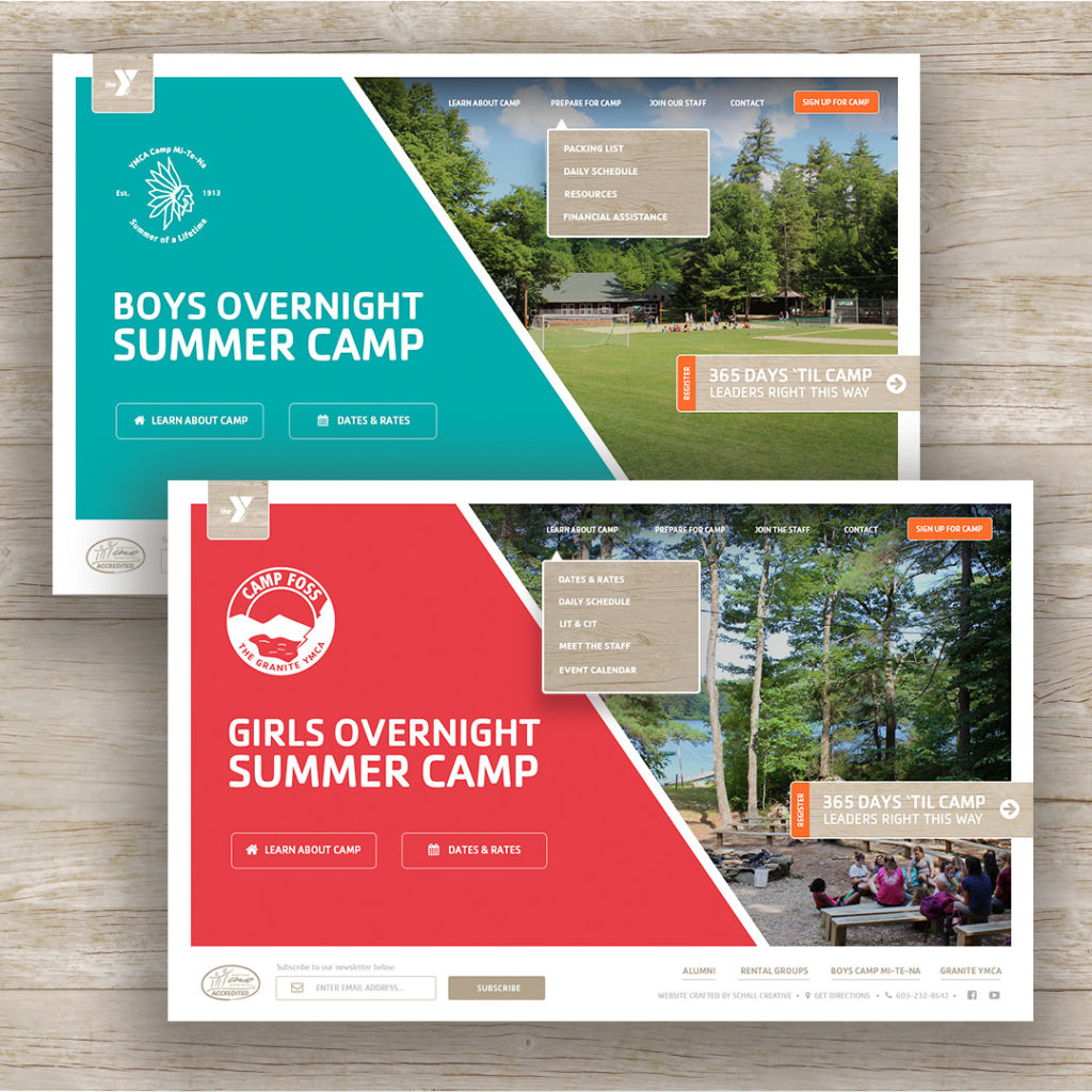
1.) Navigation Menu

Main Menu 2.0

In the previous website version, the main menu was hidden for desktop and mobile devices. It would display after the user clicked the hamburger icon menu located at the top right corner.

This time around we wanted to save our desktop users that extra click to view the main menu. In addition, the entire information architecture was reevaluated. New web sections were introduced and page titles were addressed to help visitors find the information they were looking for whether it being a parent, camper or staff member.


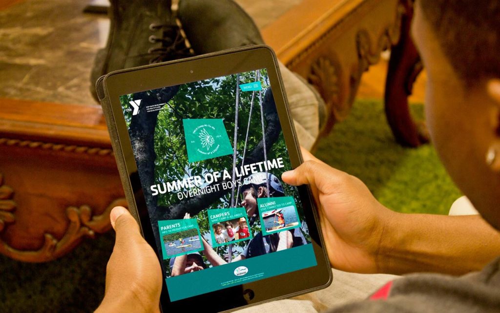
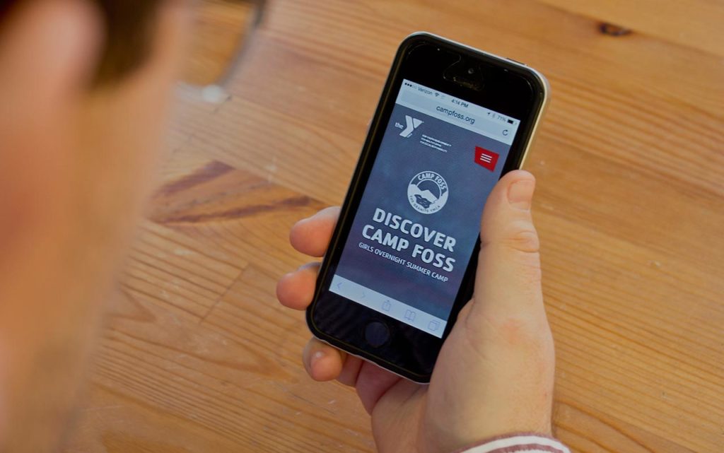
2.) Background Video

After visiting both camps in-person, it was apparent how different the experience was at an all girl camp and all boy camp. By including a background video on the home page, we were able to ensure that the first impression for our online visitors delivered that unique culture and personality of each camp.


3.) Online Application Forms

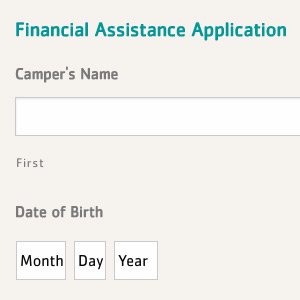
After conducting our audit, it was apparent that more and more users were visiting the website on a mobile device. Therefore, this time around we introduced more online forms so that CIT applicants or Financial Assistance didn’t rely solely on a PDF. By providing the option, we save time for our users and avoid any frustrations for those that are in need of assistance or wish to be part of the camp staff.


4.) Manageable Countdown

Camp Countdown ACF Feature

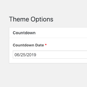
It’s important to us for assigned YMCA staff members, such as marketing managers, to have the ability to update copy and images at anytime without being concerned of breaking the layout.

The countdown feature keeps everyone on schedule and needed to be updated once a year. Therefore, a custom setup was built and added to their WordPress admin portal so that staff was able to update the countdown date without needing to know code.


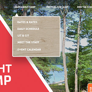
5.) Mobile Menu Navigation

Camp Foss Mobile Menu 2.0

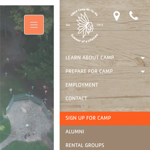
Last but not least, the mobile menu navigation experience went through a revamp. Mobile visitors now have an immediate access to call the camp and/or get directions. Main sections were simplified and helpful arrows trigger animated accordions to dropdown and display more information to access subsections.


Research Doesn’t End Here

Even after the new website launch we started discovering new needs by our visitors. As long as we stay in touch with how the website is being used, we can be ahead the game in getting somewhat close to a perfect website.

Stay agile.


Success Story: Healthcare Website helps bring in 40 New Patients

Success Story: Healthcare Website helps to bring in 40 Patients in Five Months

Palliativity Medical Group was starting from scratch. They had no brand recognition, no online traffic, no voice and no preexisting website. They came to Schall Creative and hired us to build their new healthcare website.

15 Patients in less than 2 Months.

40 Patients after 5 Months.

200 Patients after 1 Year.

About Palliativity Medical Group

Palliativity Medical Group is a Palliative Care medical practice, providing specialized medical care for people living with serious and/or chronic illness. They focus heavily on increasing the quality of life for their clients and their families by managing physical and existential pain, as well as many other symptoms of their acute and chronic illness.

Challenges

Before starting with Schall Creative, Palliativity Medical Group had a bad experience with their previous marketing company. When the relationship started to go sour, they decided to start searching for a new web agency. They needed an agency that listened to them to create the online version of their unique practice.
 
Palliativity Medical Group wanted their website to be exceptional. They needed their online presence to not only fulfill their needs but their patient’s needs as well.

Building a Website That Creates an Impact

Palliative care is a very personal situation where their needs to be trust. We made sure the website delivered that immediately by displaying pictures that captivated genuine human emotion. We wanted to make sure that a future patient was able to experience who Palliativity was, before picking up the phone or visiting their facility.
 
If it takes too long for an online visitor to find contact information on a website, it becomes frustrating. It’s very easy for visitors nowadays to move on to the next website. Therefore, a phone number and contact form visible at all times was vital.
 
Last, well structured on-page SEO was key. Healthcare websites can be beautiful and have great usability but they need to bring in new patients. We made sure this healthcare website performed as their online 24/7 sales team and brought results.
 
As a new medical practice, their initial goal was to have 15 full time patients. We were happy to hear that with the help of their online presence they are very close to hitting that goal only 2 months in. Five months later, they are at 40 patients.
 
While taking a look at their organic traffic, we noticed that not only is it steadily rising, but the people who find them through Google are spending a lot of time on the website. This means that they are finding what they are looking for, and they are taking the time to read through and learn about the practice.
 
This was a great project to work on, and seeing these kind of results a few months later is what it’s all about for us.


25 Tactics Great Websites Use


What to Research Before a Website Rebuild

What to research before a website rebuild

Rebuilding a website is exciting, but it can also be quite stressful. It’s important to start off the process on the right foot so you can avoid headaches down the road. Here are a few things you should research before a website rebuild.

Get the technical stuff out of the way

You’ll be surprised how many companies do not know their domain or web hosting username and password. Make sure you have these credentials handy as you’ll need them to update your website. If you have an IT department or have someone who does your IT work, he or she would have this information for you. IT can also fill you in on what your email hosting situation looks like. Is the email hosted on a local server or is it a third party service. Emails can get messy and sometimes lost so these are great conversations to have before hand.
 
Also, let your new web development company know if you’re looking for a new hosting company. Most likely they can supply that service for you as well. I would suggest to ask about the security of the hosting service as spam and malware is a nightmare these days.
 

Review Your Online Traffic

If you are keeping in track of your website traffic with Google Analytics, take a look at it. Try to find out your top visited website pages and look for pages where visitors spend the most time. This can give you an idea what your online visitors are interested in. You can dig in quite a bit to your online data, but at the very least try to get a high level understanding of what your online visitors are interested in on your website today.
 
If you are not keeping in track of your website traffic, start tracking immediately. It’s better to have some traffic data than no data.
 

Ask For Input

Depending on the size of your company, you may need to have a talk with your sales department and ask them what they would like to see as an improvement in the new website. Reach out to the administrative department and ask them a few questions as well. Most importantly, listen to your audience and find out if your clients are struggling with the current website in any place, shape or form.
 

Conduct a Website Survey

By putting together a survey with a series of questions can help you to decipher what’s needed. You can use a third party service like SurveyMonkey to put something together. Ask questions like, “Why do you visit our website?” and “How well does our website meet your needs?”.
 
Now if you have the resources, you can create an online form that could live on your current website. After completed and submitted, the form can then email you the client’s feedback. You can always ask your current web development company to help you put something like this together if things get a bit tricky.
 

Speak with the CEO

You’ll need to make sure that whoever is managing this project has a clear view of the company’s goals. Find out the goals first, then start thinking about how your new website can help make them happen. Make sure to have a discussion with your CEO and find out their point of view. Their opinion should have less to do with what the website looks like and the content that’s on there, and more to do with bigger picture company goals.
 

Find the Right Web Agency

To find the right web agency it is never easy. It helps if you have a budget in mind before you start looking. Putting out a generic RFP with no idea of budget can lead to trouble. We recently heard a story of a client getting quotes back that range from $5,000 to $75,000. Three months went by and they still had no idea who to work with.
 
There are many stories like this one but at the end of the day there needs to be the right fit. The right fit starts at the web company’s portfolio. There’s nothing written on taste but take a look at that portfolio and get a sense of the type of work the web firm has done. Take a look at the type of clients they’ve worked with. I would suggest to review their social media channels such as; Facebook, Twitter and LinkedIn. This can give you a sense of what their culture is like. You never find a bad client testimonial on a web company’s website but if you find recommendations on LinkedIn, I would look at those as brownie points. Last, look for success stories the web firm as shared from their existing clients.
 
I hope these research tips help you rebuild your website the right way, with the right web company, the first time around.
 
What research tactics have you used to help rebuild your website? Share your insight at the comments!


25 Tactics Great Websites Use


How to resize images using WordPress

How to resize an image using wordpress

Have you ever uploaded an awesome photo to your WordPress website or blog, and then have it take 12 seconds to load on the page? Or maybe you’ve wanted an image to take up more or less space on the page. You can do these types of edits right in the backend of WordPress. So here’s how to resize images using WordPress.

 
First, here are some basics. When we talk about image size, that means the space the image takes up on the screen. This is measured in pixels. Although they range, a common width of a website is 1000 pixels. So if you’re creating a banner image that needs to go across the entire width of your text, you might make something that is 1000×300 pixels.
 
The image file size is how much the image weighs. This is measured in bytes. Specifically in web design, you’ll be measuring Kilobytes or KB. If you upload an image and the weight of that image is being measured in Megabytes or MB, then the image is much too large.
 
So how do you know what size your images should be?
 
A large image, like a banner or something that takes up the entire width of your text, should be between 60K and 120K. A small image that is within your text should be 50KB or less.
 
Pro Tip: If you’re using Firefox, when browsing the internet, right click on any image and go to “view image info.” A window will pop up that shows you the dimensions and the weight of that image.
 
View Image Info
 
Image Info
 
You can quickly check the size of your own images using this trick to make sure they’re how you want them, without having to log in to WordPress.
 
So, now how do you edit an image to make it your desired size and weight? You don’t have to have access to photoshop to get this done if you’re using WordPress.
 

1. Upload your new media.

In the Media section, simply drag and drop or select a file from your computer. Once it’s there, click “Edit.” The image I chose is over 1 MB. Way too big.
 
Upload image
 

2. Scale the image.

Click Edit Image and scale the image to your desired width. In this case, I made it 1000 x 667 pixels.
 
resize image
 

3. Crop the image.

I also want to make sure it’s only 300 pixels high, so I’ll use the crop tool. I click and drag the section of the photo that I want to keep. It will tell me the size of my selection in the image crop box. Click the crop tool to make this happen.
 
Crop image


Then hit save and then update. You’ll notice that my file size changed dramatically when I made these updates. It’s now 109KB, a perfect size for a banner on my blog post. If yours still weighs too much after it’s cropped, you may have to compress the image using a third party software.
 
resize images using wordpress
 

4. Insert the image.

Now, when you go back to your post, you can insert the updated image.
 
And that, my friends is how you resize images using WordPress.


25 Tactics Great Websites Use


Building a Website Using HubSpot CMS Review

HubSpot CMS Blog Banner

It wasn’t until early 2015 that our agency was approached to build a custom site on the HubSpot CMS. I have to admit I was curious, but also a bit pessimistic about it’s capabilities. I’d gone through a quick demo of the product a few years prior and I hadn’t been all that impressed.
 
This time, when I started doing my research and after trying out the platform, I could tell that they had reevaluated their system and spent some time on the product.
 
Hubspot CMS Template Builder
 
Being a Joomla fan, it was nice to see the module concept applied combined with a drag and drop feature that was living on a Bootstrap grid to build a custom website template.
 
Drap and Drop Bootstrap Grid
 
The subtle details of creating spacing while typing brackets and auto-populating semicolons or removing extra semicolons when typing CSS properties was much appreciated.
 
CSS Coding in Hubspot CMS

Inbound marketing tips and real inbound stories. Delivered biweekly.

Join our community of results driven marketers.

A big plus for content creators, it’s easy to update rich content and add, or rearrange new modules without diving into the code or having to update your custom HubSpot CMS template.
 
Content Editing in Hubspot COS
 
All in all, the HubSpot CMS was pretty slick. To top it off, I was really impressed with the speed and security.
 
After we had completed our new website project on HubSpot COS, the traditional coder in me wanted to backup files immediately; custom templates, CSS files, images etc. I felt vulnerable that everything was on the “cloud.” I noticed the only way to backup a CSS file and templates was to go through a manual copy and paste process. The system does have an autosave running in the background, but I’ve never been comfortable relying on something like that. I did have a few updates fail and send me back a few steps from one login to the next, and I even had one module disappear on me. But every time I had an issue, the support team was only a phone call away and they helped me out every time.
 
Of course, the main question a client might have when deciding to use HubSpot is, “What happens to the website once I stop paying for the monthly CMS?” When beginning a web project, they always will want the option to get out without having all their work lost.


Wouldn’t it be awesome?

In a perfect world, HubSpot would have a Complete CMS Backup tab, where the user could request some type of compressed folder of their entire HubSpot website.
 
Request Full Backup of my HubSpot Website
 
Or, they could take it a step further and offer migration tools or even a migration service. They could charge a fee to migrate their HubSpot CMS website onto another platform. Of course, these services would only apply if the HubSpot website is custom built and not a purchased template. Keeping the open ended mindset, in my opinion, makes the product an easier sale, especially since our clients would be paying a monthly usage fee and they’d be paying us to custom build on top of the system.
 
At the end, if their inbound campaigns are done right, and the ROI is maximized, the conversation of removing the website from the HubSpot CMS, should never exist.
 
Keep up the great work HubSpot. At Schall, we would recommend your product any day.


Need HubSpot CMS Help?