Author: Fred Schall

Fred Schall is the co-founder of Schall Creative. He has been designing and developing websites since 1997. You can find him on Twitter @mrfredschall.

When to consider rebranding

rebranding

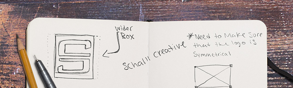
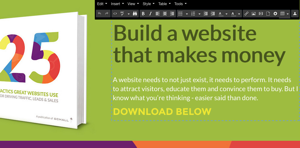
Are you thinking of rebranding? There are many reasons to why your company may need to rebrand itself. I’ve put together a small list that can help when thinking about rebranding.

Brand Recognition
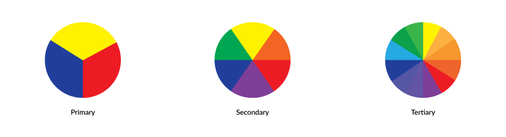
Having a recognizable brand helps customers identify your products and services with visual indicators such as logos, colors and slogans. It can be harmful to a company if their brand isn’t easily recognized. It’s worse if your targeted market confuses your brand with your competitors’ brands.
 
Outdated Brand
Pretend for a moment that your company was founded in the 60’s. Would it make sense to keep the same branding that was created when your company first started? As your company matures so should your brand. Your brand doesn’t have to have an extreme makeover but should stay relevant. You can always do research to see where your brand stands against the competition when it comes to relevancy.
 
Business evolving
Occasionally a business will grow and venture into new products and services. Recently while watching tv at my friend’s house, a Domino’s Pizza commercial came on. You may have already came across it since it aired more than a few months ago. If your one of the few people that hasn’t seen the commercial it says, “We’ve changed from Domino’s Pizza to Domino’s. Cause were more than pizza”. Once the commercial revealed Domino’s new brand, my friend reacted by saying, “That’s stupid.”
 
He may think it makes no sense but in my opinion, this rebranding should have happened a long time ago. From 2008 to present, Dominos began to serve other foods besides pizza. It should also be noted that when it comes to the name of the company, subconsciously everyone called Domino’s Pizza, Domino’s in the first place. Have you ever heard someone say, “Lets get Domino’s Pizza,” instead of, “Let’s get pizza from Domino’s?”
 
Reputation
Trusting a company is very important to consumers. Some brands just aren’t trustworthy and companies have lied to buyers. These hidden secrets may effect the way customers view their products once they’re made public. Take the food industry as an example. Consumers nowadays want to know what they are eating and if it contains harmful ingredients. Once its revealed that there are harmful ingredients in a food product, consumers will avoid purchasing this product in the future. In most cases this can result in a bit of change to a product as well as rebranding. In worst case scenarios the company may attempt to change their name, logo and rebrand completely.
 
Rebranding isn’t always the best decision. If your brand is still relevant and works then it might not be the right time for you to rebrand. If you rebrand too soon it might hurt you instead of helping you. I would do as much research as possible before making a decision about rebranding, and find some trustworthy branding experts.


25 Tactics Great Websites Use


A Logo is Art

A logo is art

This morning, Ryan Davey (our front end developer) and I were having a conversation which I think is always brought up when discussing logo design. We both agreed that we think a lot of people don’t understand or appreciate the true value of a quality logo. We also agreed that logos aren’t always perceived as art.

When a new logo for a company surfaces for the first time on the internet you usually read a familiar comment “ My (insert age) year old cousin could have made that for (insert low payment) in (insert short time frame) ”. Im not sure if thats a compliment to your little cousin or your disapproval for your little cousin’s artistic abilities but it never seems positive. These statements from viewers are common when it comes to art and here is why.
 
You can’t rush art
I think this is always forgotten by the observer. There’s a lot that goes into creating something that is aesthetically pleasing. A logo that you think took 5 minutes realistically could have taken an artist several days or weeks to design. There are various steps that are taken by a designer before finalizing a logo. Here is a quick list of steps that I take:
 
1. Identifying the brand
2. Research the industry and company’s competition
3. Conceptualize in black and white
4. Simplify concept
5. Create variations for different formats
6. Use color theory for symbolism
7. Make modifications after client feedback
 
Remember that this is just one logo that is created. In most cases there are multiple logos that will be designed and shown to the client.
 
Art is opinionated
Artists hear positive and negative remarks all the time because art is a communication of emotion. Art is supposed to make you feel emotion and this is why I think logos are always criticized heavily. The criticism is simply based off of either loving it, hating it or having mixed feelings about what you see.
 
It can take time to appreciate art
There are occasions when time will tell if your dislike will transform into love. I think a great example that I can give is the Nike swoosh. The Nike swoosh was created by Carolyn Davidson a graphic design student at Portland State University in 1971. The swoosh was chosen by Phil Knight who taught accounting at the university. Knight, who needed to meet production deadlines for Blue Ribbon Sports (now Nike) said, “I don’t love it, but it will grow on me.” His comment couldn’t be more true.
 
We are all individuals and we have our own opinions throughout our lives. Next time when critiquing a new logo, view it as a piece of art. You don’t have to love the logo but maybe with more insight you’ll appreciate it for what it is.


25 Tactics Great Websites Use


Spring 2015 SNHU Student WordPress Websites

Girls at Work Website Presentation at SNHU

The 2015 Spring semester for my Advanced Web Design class at SNHU has come to a close. For the final exam, the students presented their website project to the client, Girls at Work, Inc. The students went through a four phase process; Research, Creative, Development and Debug. Every class doesn’t always make it to the Responsive Debugging phase. I was very impressed and proud of how many students took their web projects to the next level this semester. There were some full width layouts, and many that had a focus on usability and functionality.
 

As Graphic Design Majors, they all struggle with code at the beginning. They look at code as something far fetched and alien. They go through frustrations and some even throw the towel half way. Those that stick around experience an ah-HA! moment. You start seeing the progress. While time goes by, you witness the birth of a new behavior, which was definitely present this semester. The behavior is one of accomplishment and pride of writing code and understanding it. Of course there is so much more to learn about web development and design, but to see the mind barrier in a student collapse was, simply put… awesome. The conversations that started with “I can’t” at the beginning of the semester turned into “I can.”
 

The highlight of the semester was when a few students told me they applied for a job that required designing, building and/or managing a website built on WordPress. The joy of watching them wrap up the semester with the confidence to take on that job was more than I could ever ask for.


Here are the top four websites designed and built on a custom WordPress child theme by the Advance Web Design class of Spring 2015. The top four were chosen by their client Girls at Work, Inc.


Bank Phromratanapongse

Bank GAW Final Website
 
Alex Talbot

Alex Final GAW Website
 
Joe Huskey

Joe GAW Final Website
 
Team PVRIS – Cody Favata & Matt Ryan

Team PVRIS - Cody Favata & Matt  Ryan


25 Tactics Great Websites Use


Manchester Chamber Member Led Workshop

Manchester Chamber Workshop

Last month, we had the opportunity to present to a group of Manchester Chamber members at a Member-Led Workshop. The event was sponsored by Optima Bank and 900 Degrees, who provided some delicious pizza. We had a room full of small business owners and marketing professionals who were eager to learn about HubSpot and Inbound Marketing.


The Member-Led Workshop is held at the manchester chamber once a month, and is one of the many opportunities chamber members have to connect with one another and to learn about some of the services their fellow members offer. We chose to talk about Inbound Marketing and take the room through the Inbound Methodology.
 

manchester chamber

gmcc-fred-speaking

gmcc-manchester-sign


We talked about how we use inbound to turn strangers into visitors, visitors into leads, leads into customers, and customers into promotors of our product of service. Throughout the journey we gave some examples of how the HubSpot software makes this process organized and extremely powerful. If you’re interested in hearing about our future events, subscribe to our mailing list and we’ll be sure to keep you in the loop.


GMCC Stacey and Fred


Inbound Marketing Checklist


Building a Website Using HubSpot CMS Review

HubSpot CMS Blog Banner

It wasn’t until early 2015 that our agency was approached to build a custom site on the HubSpot CMS. I have to admit I was curious, but also a bit pessimistic about it’s capabilities. I’d gone through a quick demo of the product a few years prior and I hadn’t been all that impressed.
 
This time, when I started doing my research and after trying out the platform, I could tell that they had reevaluated their system and spent some time on the product.
 
Hubspot CMS Template Builder
 
Being a Joomla fan, it was nice to see the module concept applied combined with a drag and drop feature that was living on a Bootstrap grid to build a custom website template.
 
Drap and Drop Bootstrap Grid
 
The subtle details of creating spacing while typing brackets and auto-populating semicolons or removing extra semicolons when typing CSS properties was much appreciated.
 
CSS Coding in Hubspot CMS

Inbound marketing tips and real inbound stories. Delivered biweekly.

Join our community of results driven marketers.

A big plus for content creators, it’s easy to update rich content and add, or rearrange new modules without diving into the code or having to update your custom HubSpot CMS template.
 
Content Editing in Hubspot COS
 
All in all, the HubSpot CMS was pretty slick. To top it off, I was really impressed with the speed and security.
 
After we had completed our new website project on HubSpot COS, the traditional coder in me wanted to backup files immediately; custom templates, CSS files, images etc. I felt vulnerable that everything was on the “cloud.” I noticed the only way to backup a CSS file and templates was to go through a manual copy and paste process. The system does have an autosave running in the background, but I’ve never been comfortable relying on something like that. I did have a few updates fail and send me back a few steps from one login to the next, and I even had one module disappear on me. But every time I had an issue, the support team was only a phone call away and they helped me out every time.
 
Of course, the main question a client might have when deciding to use HubSpot is, “What happens to the website once I stop paying for the monthly CMS?” When beginning a web project, they always will want the option to get out without having all their work lost.


Wouldn’t it be awesome?

In a perfect world, HubSpot would have a Complete CMS Backup tab, where the user could request some type of compressed folder of their entire HubSpot website.
 
Request Full Backup of my HubSpot Website
 
Or, they could take it a step further and offer migration tools or even a migration service. They could charge a fee to migrate their HubSpot CMS website onto another platform. Of course, these services would only apply if the HubSpot website is custom built and not a purchased template. Keeping the open ended mindset, in my opinion, makes the product an easier sale, especially since our clients would be paying a monthly usage fee and they’d be paying us to custom build on top of the system.
 
At the end, if their inbound campaigns are done right, and the ROI is maximized, the conversation of removing the website from the HubSpot CMS, should never exist.
 
Keep up the great work HubSpot. At Schall, we would recommend your product any day.


Need HubSpot CMS Help?


Custom Logo Design vs. Stock Logos

Stock Logo Design

Above you see a logo I created using a stock image that I found online. It took me about 5 minutes start to finish.
 

Many people may not know the difference between a custom logo design and a stock logo upon looking at it, but those differences are vast. The biggest one being that when you purchase a stock logo, you don’t truly own that logo. That same logo can be sold to hundreds or even thousands of other businesses. You have purchased a license to use that logo, and that comes with restrictions.

Stock logos are similar to stock photographs. Websites that sell photography and illustrations for a one-time payment are known as royalty free stock websites. When purchasing imagery from a website like Shutterstock all assets are under a royalty free copyright license. You are given the right to use the asset you purchased without having to pay fees for how many times you use the imagery. But it’s important to read the fine print. Stock logos or images often have restrictions based on how many people will potentially see it. If you purchase a stock logo, and it’s seen by millions of people, other people won’t want to purchase that same stock logo.
 
The biggest issue with stock logos and stock imagery is the licensing is usually non exclusive. You can purchase a logo just as you would a stock photo online but that same logo is representing another business with a different name. Many business owners fall into buying stock logos or stock imagery because they are a cheaper option instead of paying a professional for a custom logo design.
 
I personally would advise all business owners to avoid purchasing a stock logo or creating a logo that contains stock imagery. If image is important to you, spending the extra money on a custom logo design is well worth it. I would also do my research when purchasing a logo to make sure that you’re not purchasing a logo that already exists. One thing that you can do to see if your logo is a stock logo or contains a stock image is to use Google’s image search. Try it out and see what happens.
 
Looking for a custom logo design? Contact us!


Inbound Marketing Checklist


Palm Trees in New Hampshire

Palm Trees in New Hampshire

Our cure for the winter blues? Palm trees.

When we made the move to New Hampshire from Southern California in 2010, the winters were pretty tough on me. In an effort to keep my sanity without jumping on a plane back out west, I filled up our then 350 square foot office with about five or six 6′ tall majestic palm trees. Happily, my plan worked and I went to work every morning in sub-freezing weather with a smile on my face. I heard they could grow as high as 12′ tall, but after years of trial and lots of error taking care of them, I had to let them go.
 
When we moved into the Waumbec Mill in 2012 I was itching to take advantage of our new 14′ ceilings. I knew from past experience that growing a palm tree indoors in New England was just not plausible, so we decided to do the next best thing.
 
In an effort to bring back the California sunshine, we put together some artwork that included SoCal palm trees and a flock of California wild parrots. We paid special attention to the palms, as we wanted them to match the trees we used to see on the boardwalk in Venice. The result created such a warmth, I swear we can now feel the coastal breeze when we walk in the door every morning.
 
Now, our palm trees are very low maintenance and vary from four and an half to twelve feet. Our cali wild parrots are always on a mission and as for the coastal breeze, well, ceiling fans will have to do for now.
 
So if you’re feeling a bit gloomy and the weather is getting to you, stop by and spend some time with us. You never know, maybe some palms, parrots and a slight breeze might to do the trick.


How Girls at Work Inc. is Helping SNHU Students

SNHU Advanced Web Design

Girls at Work Spring 2015 Semester
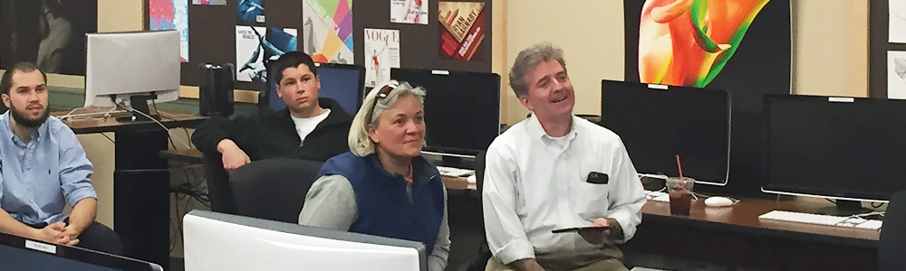
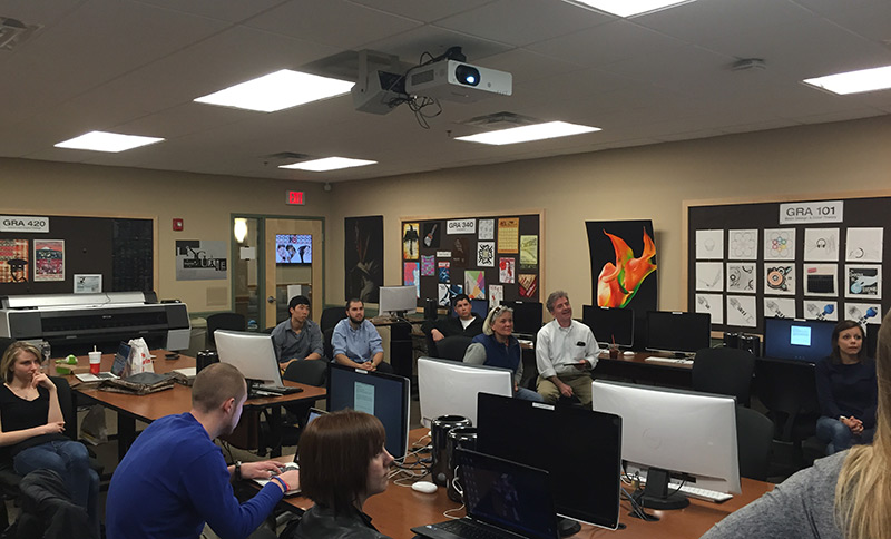
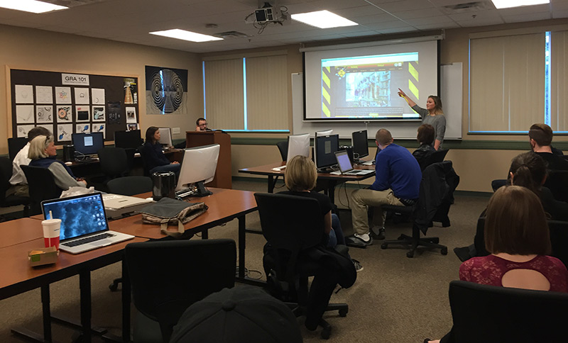
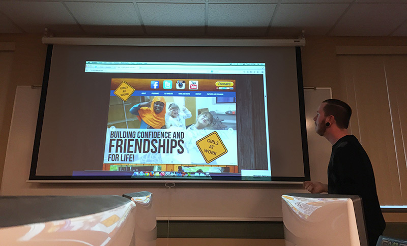
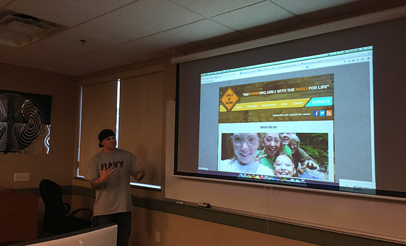
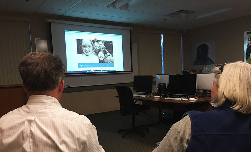
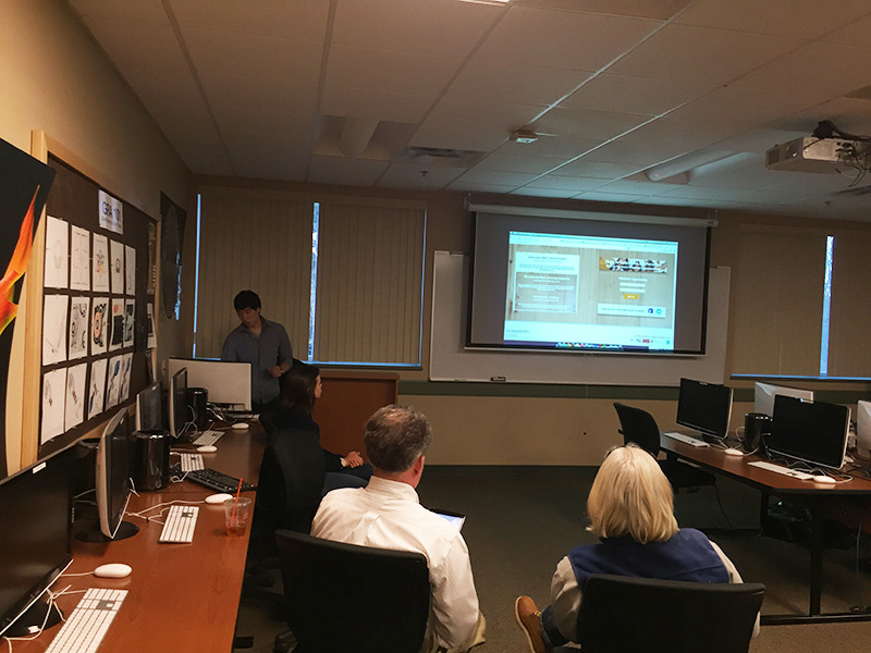
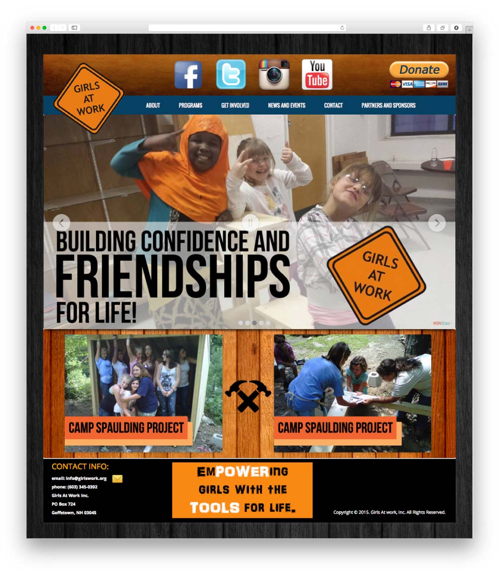
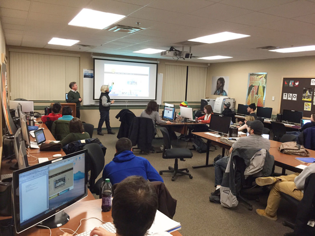
Since Fall of 2013, I have been teaching Advanced Web Design at Southern New Hampshire University (SNHU) in Manchester, NH. The course program is designed for students to have a real world experience by working with an actual client.


I’m always on the look out for companies or organizations that are willing to participate by letting the students build them a website. We ask a representative from the business or organization to attend a class so that the students can learn about their organization and its goals, and to ask them questions they may have. At the end of the semester, the representative comes back and the students present their websites to them, and the “client” then has the option to choose a website for their organization.


Our goal is to help this new generation of digital designers get their hands dirty with code, and so they can see the bigger picture when it comes to website design and development. Students will look for an internship to gain some real world experience. Why not bring the internship to them?


Girls at Work Elaine and Rob
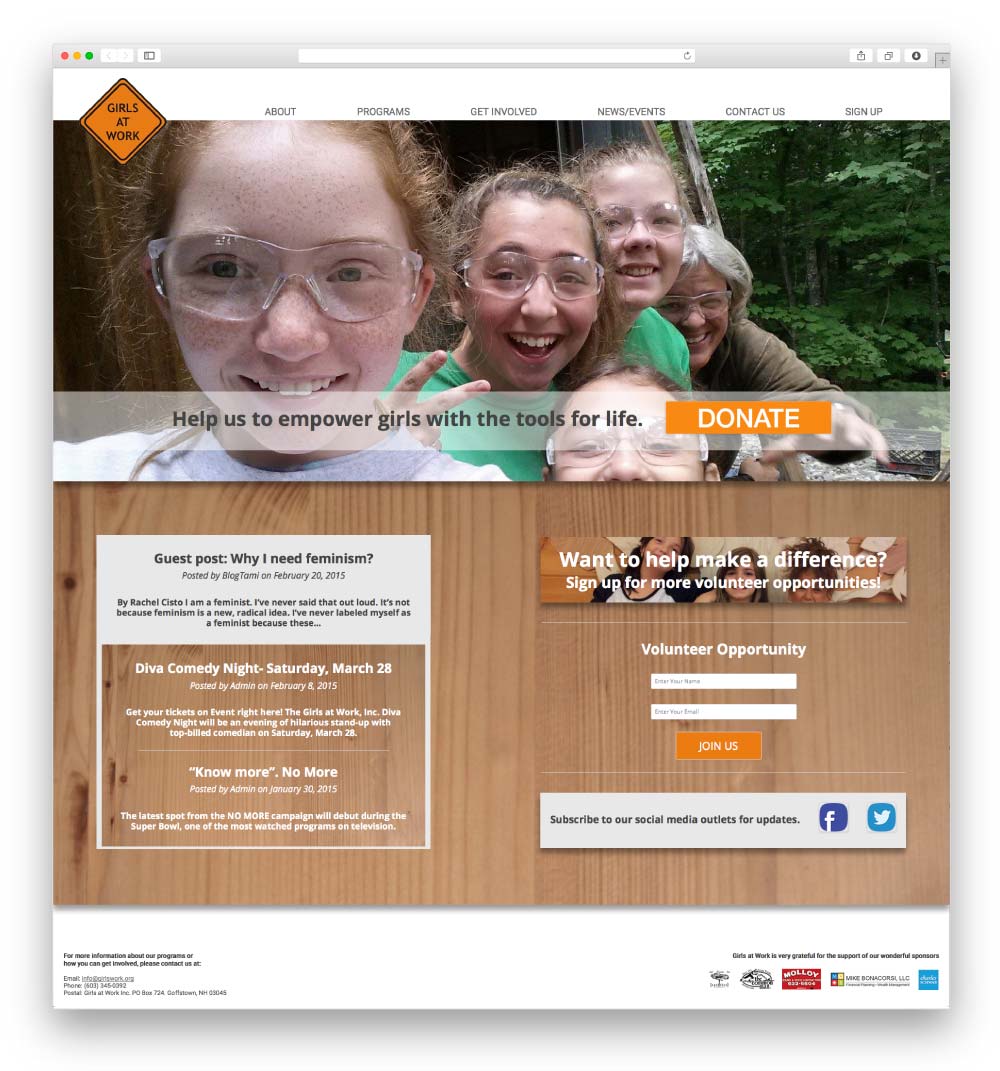
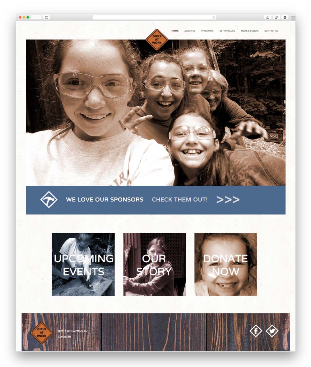
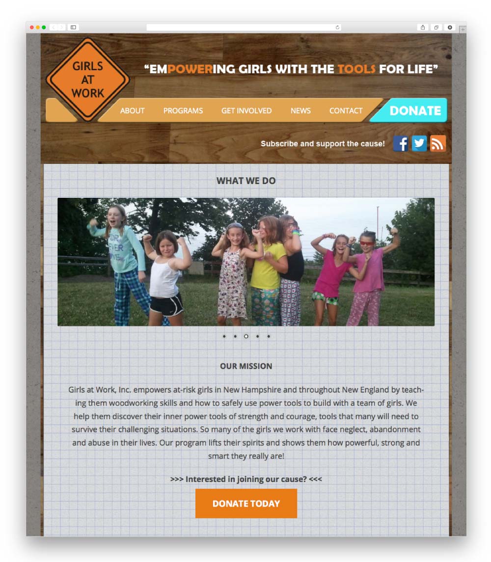
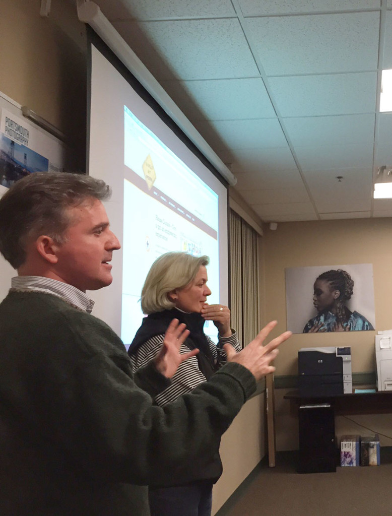
Girls at Work Inc, empowers at-risk girls in New Hampshire and throughout New England by teaching them woodworking skills and how to safely build using power tools. Elaine Hamel, director and founder of Girls at Work, and Rob Grimmett, Board Chair, volunteered to give the SNHU students the opportunity to build them a new site.
Through this experience, the students are also able to get a first hand look into how a non-profit organization works, and all the great work they are doing for our community. The semester ends in May, and I can’t wait to see what my students come up with.


SNHU also has a Social Media class that does a similar project. The students get to choose from a group of non-profit organizations and create a social media plan for them. Through interviewing the organization and their own research done throughout the semester, they deliver a complete social media plan that the organization can then execute.


As it turns out, a student in my Advanced Web Design class is also in this Social Media class, so her group chose Girls at Work as their non-profit. Now this particular student has the opportunity to create an even more complete digital strategy for Girls at Work.


Stay tuned to see what the students come up with, and check out all the great work Girls at Work does for girls in the area.


25 Tactics Great Websites Use


DIRTT Walls

DIRTT Walls at Schall Creative

Our agency is currently located in a beautiful mill building built in the late 1800’s. It has 14 foot ceilings, original hardwood floors, and long wide hallways. The character of the mill had us sold the moment we walked in. As our agency grew, our space did as well. We kept an open concept up until now and as much as we loved it, we had no privacy. We consistently found ourselves having private talks outside. We needed a solution that would give us that privacy but still maintain the open concept feel.
 

We connected with Creative Office Pavilion late last year, and they developed a solution for our space. With their design help and implementation of our new DIRTT walls, we now have the modern and versatile workspace we were envisioning.
 
We are looking ahead for 2015 in our newly improved environment, that still maintains the 1800’s character of the Manchester Millyard.


Choosing the Perfect Logotype

Typography_header

If you’re a designer you should know that most logos are composed of two main elements, the symbol or emblem and the logotype (a single piece of type). There are some logos that only consist of a font to visually represent a company. When crafting a logo most designers choose the logotype after creating the symbol. This is done because its easier to compliment the symbol after its constructed. But what about the logos that don’t have a symbol? Lots of big brands like Coca-Cola, IBM, and Google create their logos with just type. Logos like these make logo development seem easy to an outsider. But deciding which font a company should use is really difficult, especially in a digital world with an infinite amount of typefaces. Here is a simple guide to start with when you’re choosing the right typeface for your company’s logo.
Times new roman type

*Useful throughout everyone’s school career, preferably used at 12pt- Times New Roman

Serif– Serif fonts can be distinguished by the small lines at the end of a letters stroke. These lines can be found at the top of the letter as well as the bottom. A serif font has a formal feel which is why its described as traditional, classy, and professional. Businesses that use these fonts are usually banks, law firms etc.
Helvetica Font

*Superlative design award for “most reliable”- Helvetica


Sans Serif– It may be hard for some people to differentiate or remember the difference between Sans Serif and Serif fonts. Sans Serif fonts do not have small lines at the end of a letters stroke, hence the word “sans” which in french means “without”. A Sans Serif font is an informal font that is friendlier and more inviting than serif fonts. Sans serif fonts are modern and are used more often in the world of branding and logo design.


Bickham script MM font

*The essence of formal but fashionable- Bickham Script MM


Script– The word Script is defined as ” something written”. The characters in script fonts look handwritten instead of printed which makes this typeface easy to recognize. Most people classify script fonts as cursive writing because of the natural flowing strokes that join characters together. Script fonts are elegant fonts that correspond well with luxurious brands.


Acknowledging the characteristics of each typeface should shorten the process of searching for the proper font.


If you’re still not satisfied with a free or purchased font you can always create your own logotype or tweak an already made font to meet your needs. This can come in handy when your trying to create something that’s completely original.


There are hundreds of thousands of fonts to choose from. Being able to think about your business, and the message it wants to convey before diving into these fonts will help narrow down your choices. It’s also a good idea to pay attention to the brands that you see, and think about how their logotypes make you feel. This will help you make those connections with the brand you are designing for.


Have a comment or a question about branding? Send us an email at [email protected]


Inbound Marketing Checklist


Cross Browser Compatibility

The further into the internet age we get, it seems as though the more freedom we are given. You can access the internet through a variety of devices, and also through many different browsers. In the beginning there was simply Internet Explorer, but today we have Firefox, Chrome, Safari, Opera, and still Internet Explorer. Because no two of these browsers are alike, a website may display a certain way on one browser, and a completely different way on another. Making sure a website works properly on all browsers is what we call cross browser compatibility.


Browser Variety


The fact that there are so many different browsers out there can be difficult to deal with, but it gets even more complicated than that. Some people still have some very outdated versions of browsers they are running on their computers, which is why it’s so important that you know your audience. In most cases you do not really have to worry about designing for outdated browsers because the majority of people know to update their browser to help experience the best the web has to offer. However, if you were to be designing a website that would target for instance, an elderly demographic, you will want to take this into consideration. Some people just do not understand computers and software well enough to grasp that they should update or do not do so out of fear of causing harm to their computer. The existence of viruses, malware and the like make many people afraid to download things even if they appear to be trustworthy.


Remember the User


To maintain a properly functioning, great-looking website, you have to be aware of cross-browser compatibility and also with responsive design. You have likely encountered websites that don’t display properly on your browser, and this can take away from your overall experience. When designing with cross browser compatibility in mind it is just like any other aspect of design, you must think of the end user, what their needs are, and how to meet them. If you adhere to these guidelines then you will set yourself up for success in every project you take part in.


25 Tactics Great Websites Use


Color in Branding

Color in Branding

One of the most important elements in brand design is the use of color. Color in branding helps to increase recognition for a company. Color can reflect a brand’s purpose as well as their personality. When combined with a simple but clever logo, you can create a unique brand that will be recognized for years to come. Here are some notes that can help when you’re choosing colors for your brand.
 
The meaning of color
The meaning of color can vary from person to person. For example, the color red can be associated with anger, violence, energy, passion, seduction or the symbol to stop. Red is among one of the most popular colors in the world and is highly used for branding. Take a moment to look at each color below and think to yourself, “what do I associate with this color?”

Branding Colors

Color Harmony
Color harmony is when you combine colors that work well with each other. Do you remember the color wheel in art class when you were younger? If so, you would remember that there are three categories based on the color wheel. (primary , secondary, and tertiary). There are various formulas that can be used to create color harmony.
 
Primary color: one of the three colors red, yellow, or blue which can be mixed together to make other colors.
 
Secondary color: a color (such as green, orange, or purple) that is formed by mixing two primary colors.
 
Tertiary color: a color produced by mixing two secondary colors.  Color Wheels
Complimentary
Complimentary colors are any colors that are opposite of each other on the color wheel.
 
Analogous colors
Analogous colors are three colors that are side by side on a 12 section color wheel.

Complimentary colors

Choose colors that relate to your company and will help your brand stand out from the crowd. Think about how these colors make you feel and what they will portray to your audience. It’s important to be aware of how colors work and why, but also know that there are no rules set in stone. Don’t be afraid to go with your gut.


If you have any questions about branding contact us here.


Inbound Marketing Checklist