

If you’re interested in using your website to collect leads, sell products or gain customers, you need to understand how it’s working and how you can make improvements. A website audit can help you with that. There is more than one way to audit a website, and this guide will help you get started with a few useful tools.
What is a website audit?
A website audit is a detailed look into how your website is performing. This goes from how it is attracting visitors (SEO) to its usability (UX) and at what rate visitors are converting into contacts (CRO). A website audit will reveal issues that need to be fixed, as well as opportunities for improvement.
Why do you need a website audit?
A website audit helps you build an actionable list of steps to take to increase website traffic, improve engagement and raise conversion rates. Basically, it allows you to understand what’s happening on your website, so you can make a plan to add content and make updates that will help you reach your goals.
Where to start
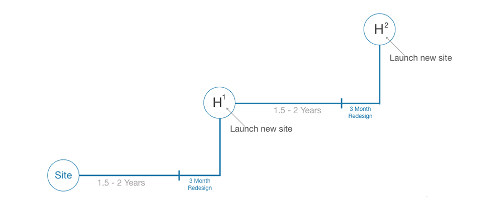
The best place to start when conducting an audit is to revisit the goals of your website. There is no shortage of data on how your website is performing and it can get overwhelming. Your goals help you decide what data is important to look at. Your goals can include collecting leads, increasing traffic, or having people make purchases on your site.
What is included in an audit?
As mentioned above, there is more than one way to audit a company’s online presence. The tools discussed today lean towards organic, content-driven insights like SEO and User Experience. They focus on both quantitative and qualitative data and can give you the 50,000-foot view as well as the up close and personal. These tools will help you empathize with your users, and look at things from their perspective.
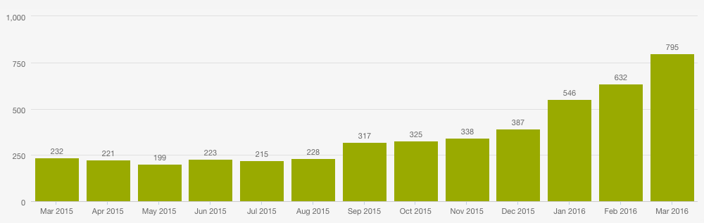
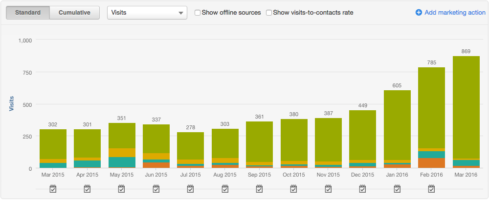
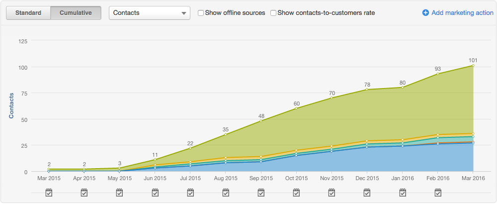
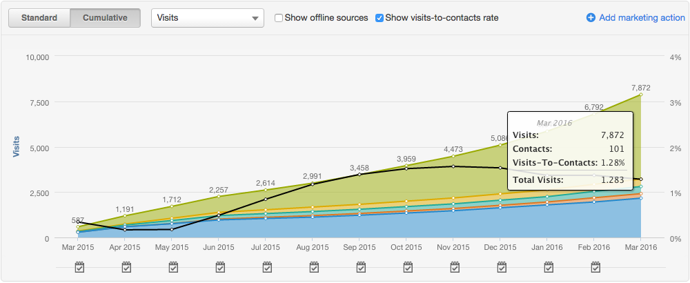
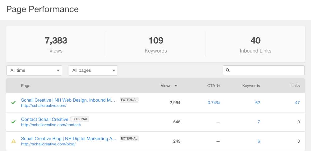
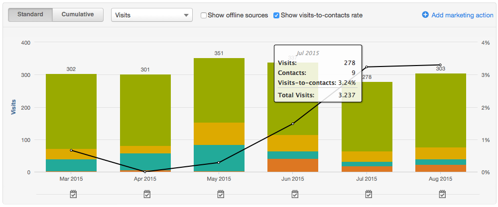
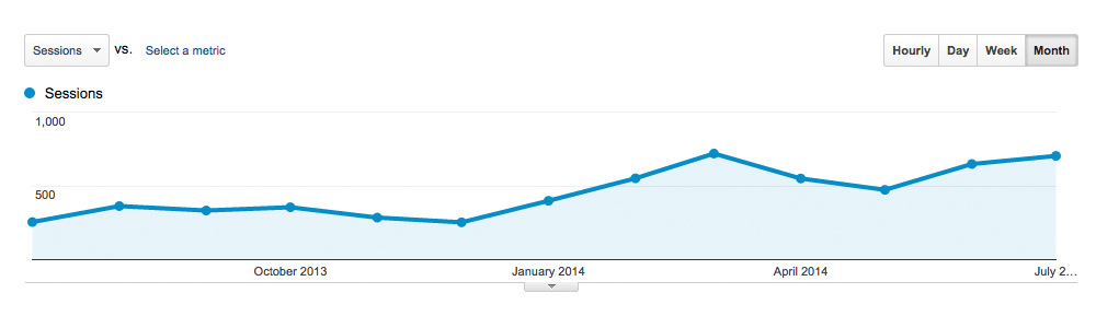
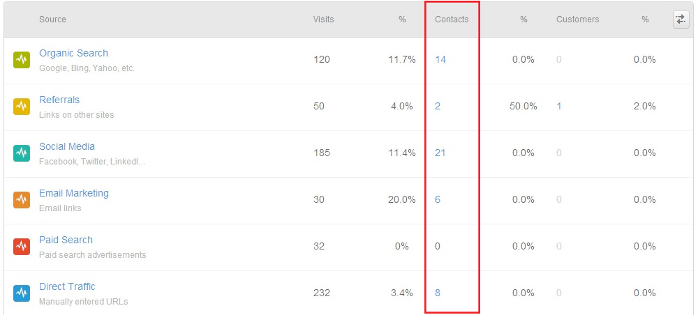
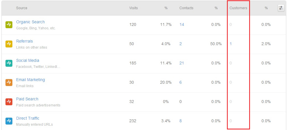
Google Analytics
Google Analytics can give you a very good picture of what is happening on your site. If it’s set up properly and collecting data, it can answer some important questions like how your users are finding you, what devices they are using, and did they get what they were looking for. Here are a few reports that are a good starting point when using google analytics.
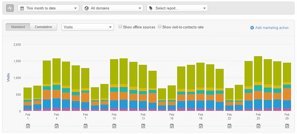
To see where users are coming from, go to acquisition.

The acquisition overview will give you an idea of which channel your users came from. If you want to focus on just one channel group, type it into the search bar. The referral channel will show you websites that are linking to your site and bringing traffic. To drill down further into these numbers you can click the blue plus and add another dimension like session source.
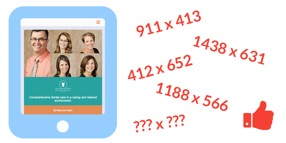
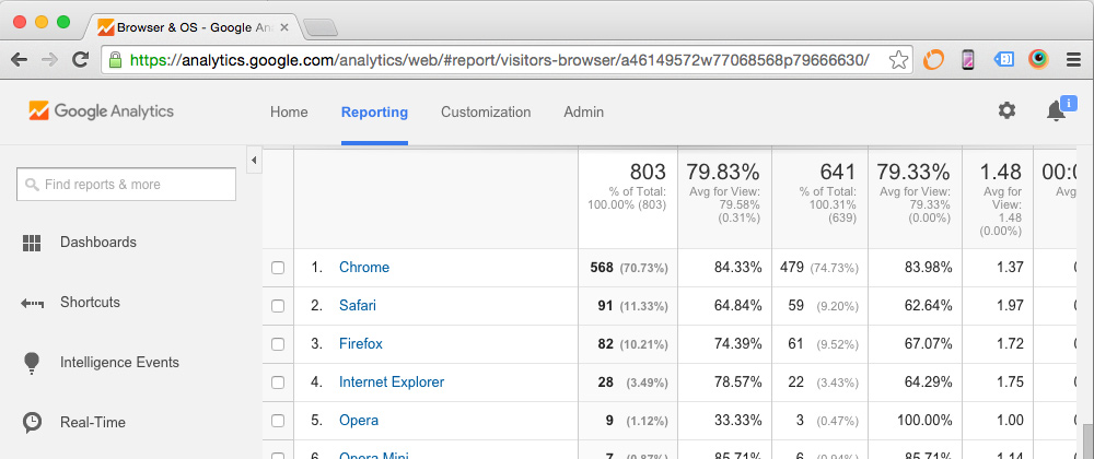
To see the device type your users are on, use the Tech report.

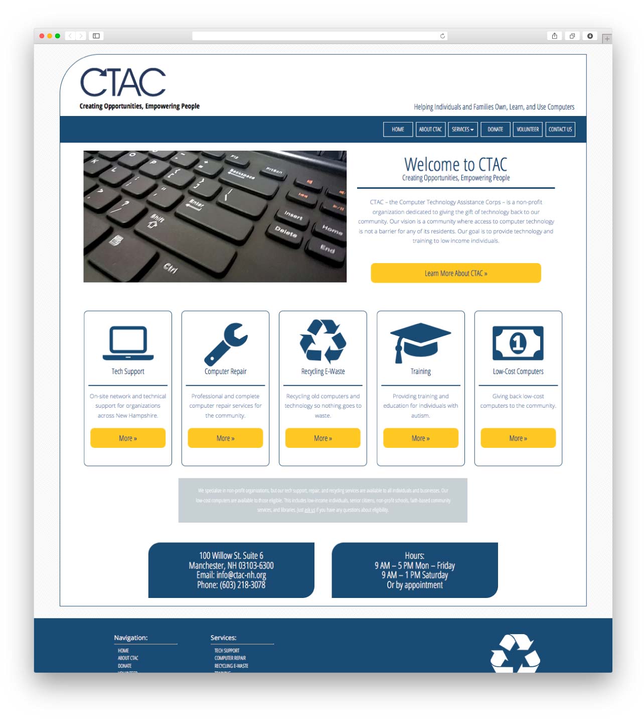
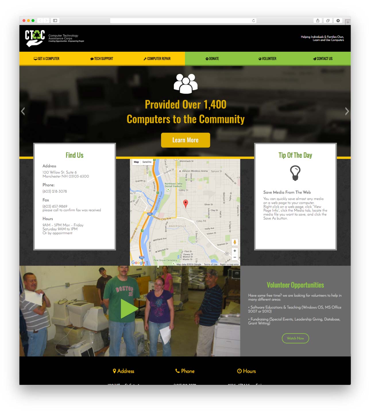
This allows you to see not only the device type but also which browsers your users are on. Make sure you are viewing your website in every possible screen resolution and checking for bugs or design flaws. A UX tool like Hotjar will also help with this.
If you want to learn more about using Google Analytics we recommend taking the Google Analytics Skillshop Course or checking out Measure School’s content.
Google Search Console
Search Console gives you a look into how your website is appearing in search results and it also surfaces issues that need to be addressed. In the performance report, you can see queries that users are searching for when they find your website, as well as which pages are ranking. Filter on click-through rate, impressions, and average position to get an idea of where to focus your attention when creating content. For example, if you are ranking 5th for a query with many impressions but a low click-through rate, you may want to figure out how to boost that ranking up a few spots.

Under indexing, you’ll see your pages that are properly indexed and those that are not. It will also show you reasons why pages are not indexed. You can also upload a sitemap and submit page removals in this section. For a free tool, Search Console gives you a whole lot of insight into SEO.
To learn more about Search Console, check out this deep dive.
Paid SEO Tools
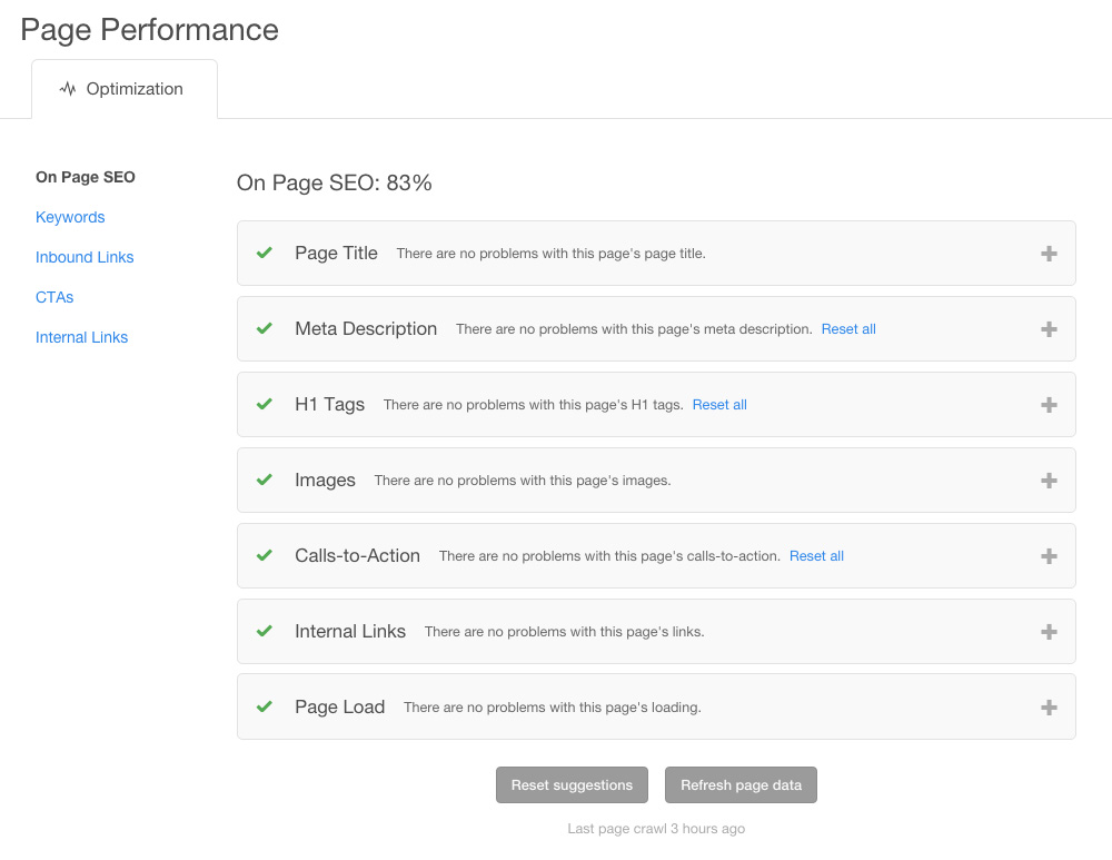
There are also plenty of paid SEO tools that can create in-depth reports on your website. Raven Tools has a site auditor report that aggregates all your website’s SEO factors into a comprehensive and actionable report.

It’s the easiest way to find all the things that need attention, and it essentially creates a checklist for you to work your way through those issues. Raven also has tools for competitor research and link building. These reports are incredibly useful when building out an SEO strategy.
UX Tools
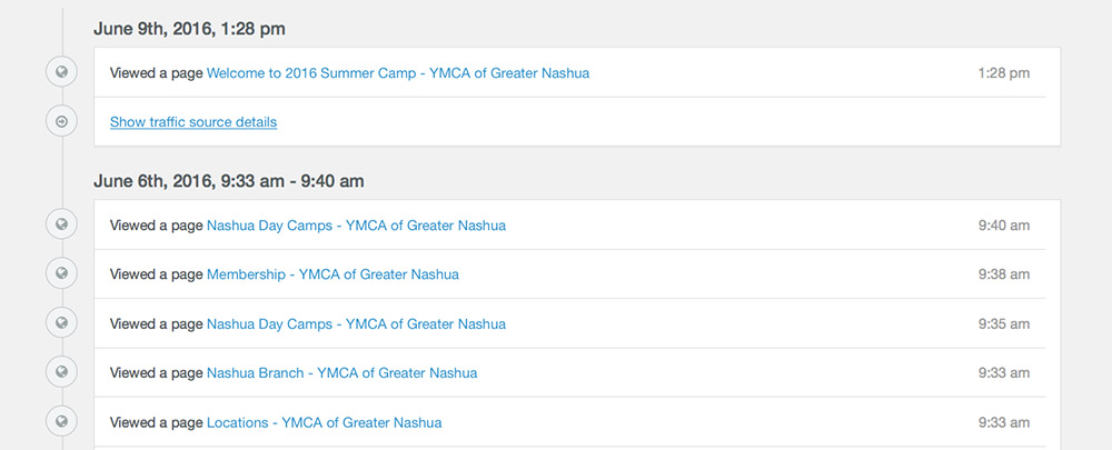
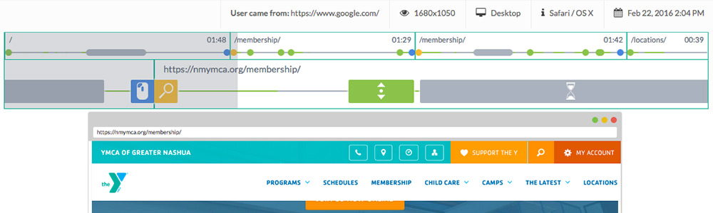
During your website audit process, it’s a good idea to look into how people are interacting with your website, and a UX tool like Hotjar will do just that. Hotjar collects recordings, heatmaps, and feedback from users directly from your website.
Watching recordings of users on your website can be time-consuming, so Hotjar organizes these recordings so you can easily filter through the ones that are worth watching. You can add notes for your team about bugs or issues that need to be fixed and flag recordings to share. These recordings allow you to step inside your user’s shoes, and empathize with them as they are looking for value.

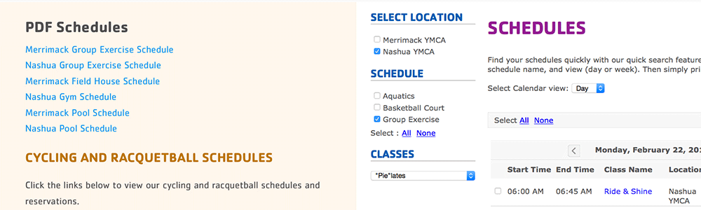
Heatmaps give you a broader view of how your site is being used. You can see where people are clicking and scrolling and make sure they are making it to the content that you want them to see. We are still often surprised about what people will click on, and it gives great insight into what people want to know more about, which leads to us creating more content on a specific subject.

A website audit is the best place to start when you are planning website updates, and it’s also a great thing to revisit as you continue to grow your content strategy. This is a sampling of the tools we use at Schall Creative when we complete website audits for our clients. If you have any questions or are interested in having us do an audit for you, feel free to reach out.


Recent Comments